Inspiration Article
At home with Heritage: bring your tastemaker palette to life
To pay homage to the sensory quality of the shades in the Heritage Collection – which blend the classic colours of times gone by with the contemporary hues of tomorrow – we asked three creatives to curate palettes that reflect who they are.
From The Restaurateur Palette by Ravinder Bhogal to The Interior Designer Palette by Christian Bense and The Florist’s Palette by Iona and Romy from Sage Flowers, all of them are completely unique and utterly beautiful. Ravinder’s evocative palette was inspired by her rich upbringing in Kenya full of exoticism and flavour; Christian was drawn to the dramatic schemes that have become a signature in his sophisticated curation; and Iona and Romy’s whimsical palette reflects their most creative and colourful projects from the past.
Here, we explained how you could curate your own palette using the 112 colours in our range, with expert tips from our creative director Marianne Shillingford. She explained where to look for inspiration – whether the spaces and places around you, or the clothing, food and memories you cherish – and encouraged you to be bold and experiment.
But while there’s an art to curating a palette, applying it to surfaces is more of a science, as marketing manager Stephanie King explains. “Pulling together a decoration scheme for your home can often feel overwhelming, with so many colour choices and pieces of inspiration out there, not to mention the opinions of your nearest and dearest!” She continues: “Even the professionals suffer from idea-overload sometimes, but one important thing always remains true: stick to what you love. Once you’ve found that perfect ‘anchor’ in your room, or an object or pattern you just can’t live without, the rest will start to fall into place. Then, with some insider tips and tricks under your belt, you’ll be off to a flying start in turning your vision into a reality. The glorious thing about our range is that a lot of the hard work has been done for you. Our colour experts have compiled timeless shades that will outlive trends as well as stand up to the tough standards of a busy home. Looking beautiful is one thing, but working beautifully is completely another, and the Heritage Collection delivers both in spades.”
Try before committing to your colour
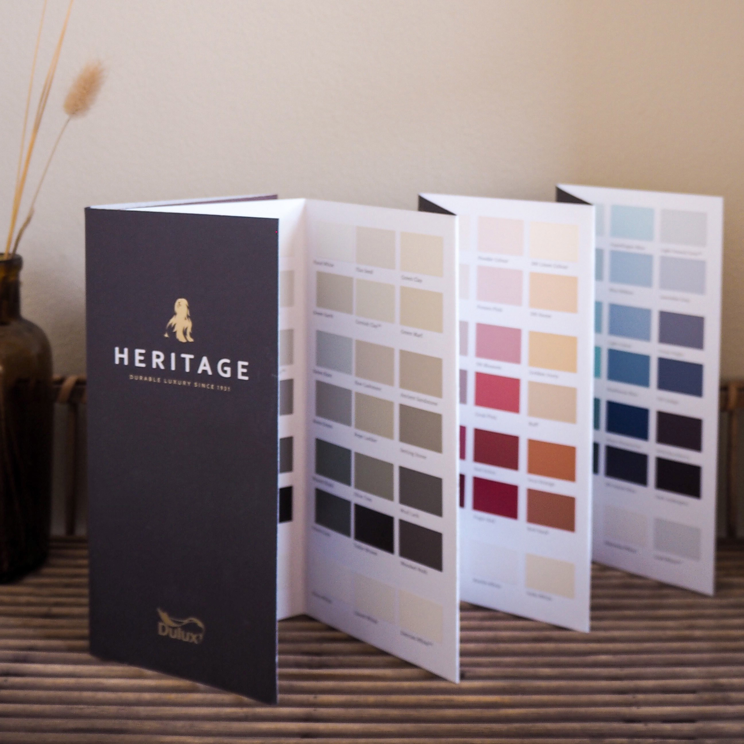
Once you’ve selected a suite of shades, it’s important to visualise them on your surfaces, as sometimes your imagination doesn’t paint an accurate picture. Steph says: “Imagining how colours will work together on a practical level is one of the toughest tasks when it comes to bringing your vision to life. After all, how do you know if the combination works? My go-to is looking at our free printed Dulux Heritage Colour Card as the hues are displayed in an inspiring and intuitive way. They start with popular, modern neutrals, then flow through the colour spectrum from warm, reds, ochres and golds, to cool greens, teals and violets. Looking vertically, each column of colour is split into pale, mid and deep tones of every shade, all creating their own unique look and feel. If you’re looking to create light, airy and dream-like spaces for tranquillity, then sticking within the pale tones is a sure-fire way to succeed, whereas the deep tones will create cosy, sumptuous and sultry rooms perfect for enveloping yourself in.” But the best bit, according to Steph, is the coordinating white. “Every column of colour has a perfect white that coordinates effortlessly with the colour above it. Take Chalk White, for example, with a fresh, crisp nature that works brilliantly with the cool greys above it. Likewise, Marble White with its delicate hint of warmth contrasts beautifully with the pinks and reds it sits beneath.” Enabling you to choose the perfect palette completely seamlessly, the Colour Card is one of the most powerful tools in your decorating arsenal, and better still it’s complimentary.
Put your paint to the test
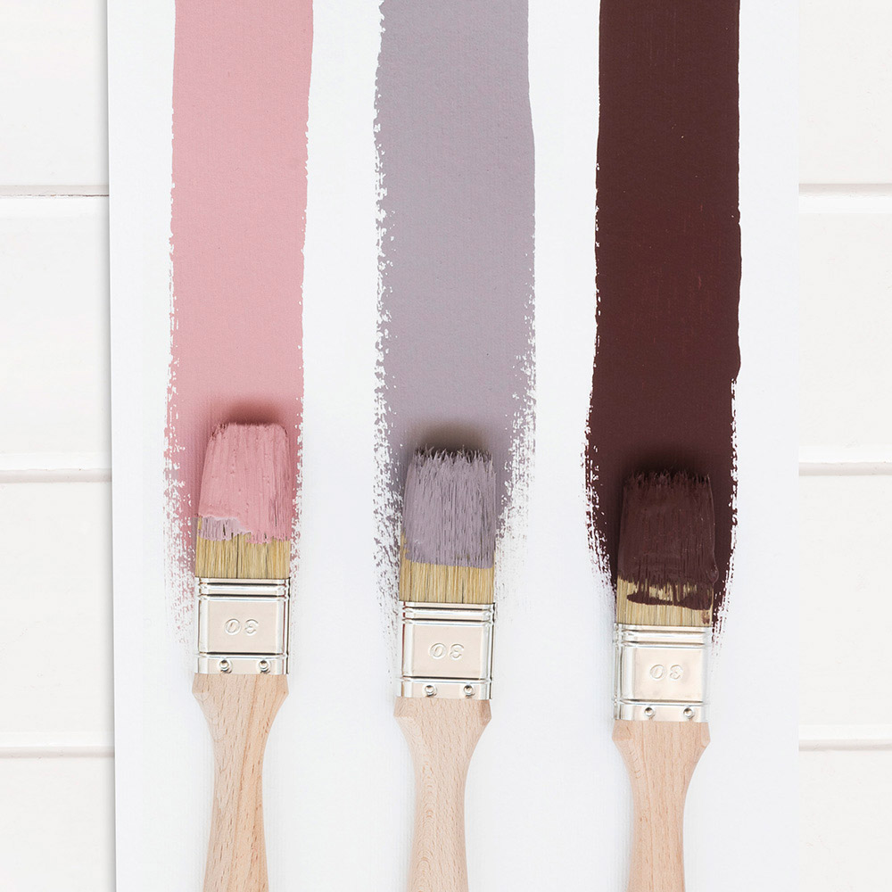
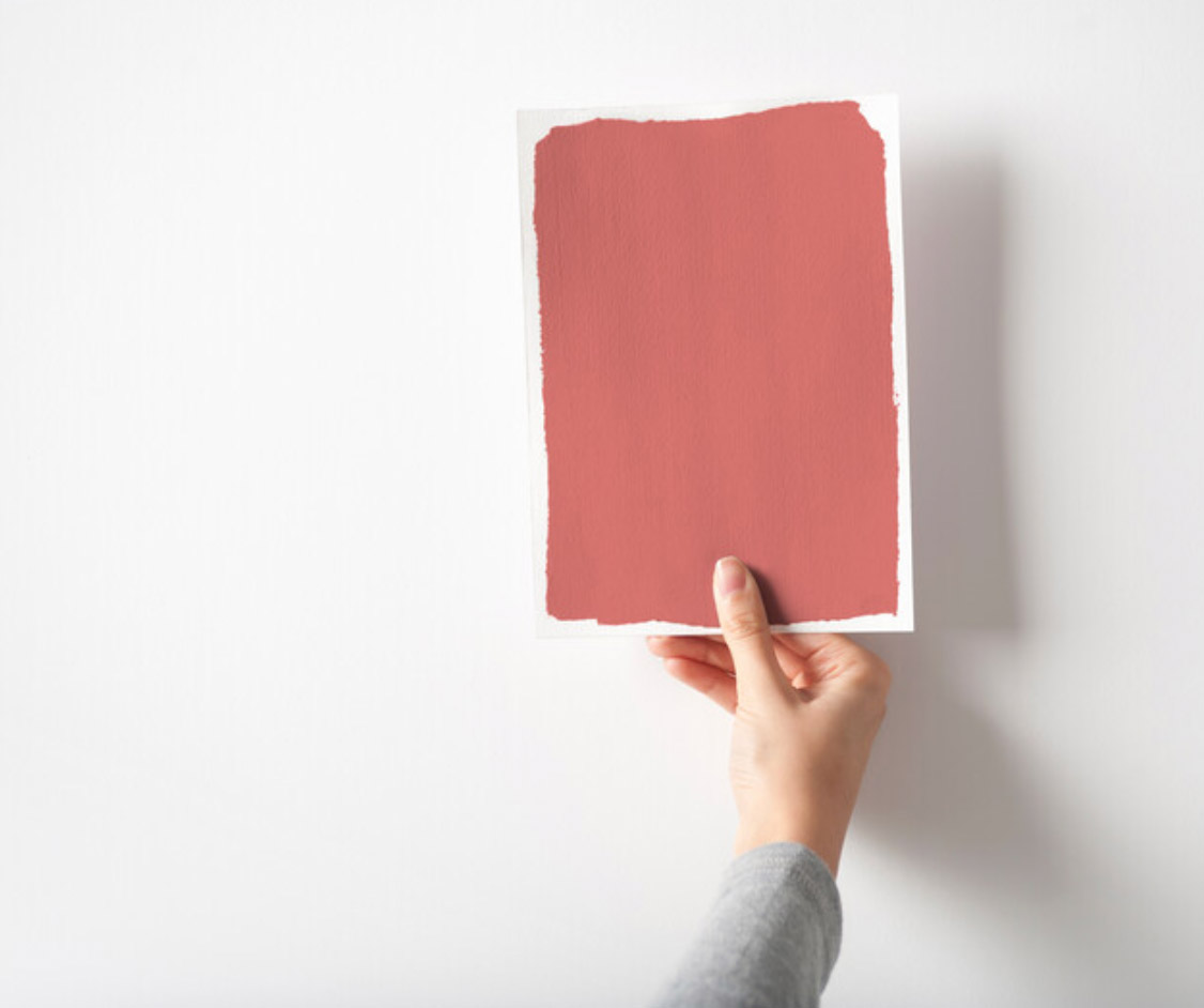
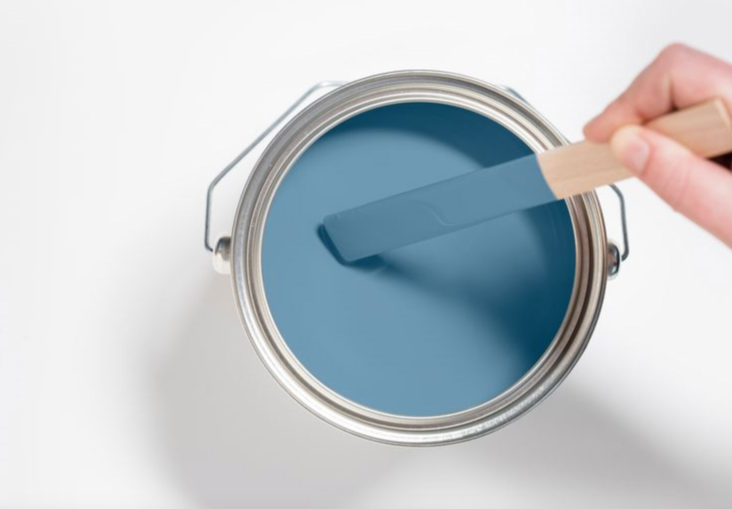
The saying ‘try before you buy’ is never truer than when it comes to paint. After all, making a mistake with colour isn’t only a waste of time and money, but you’ll have to live with a shade you don’t like unless you change it. Says Steph: “An absolute must-do before you dive in is to test your paint before committing your time and money. Colour can change so readily depending on different factors, such as the orientation of the room, the amount of natural light it receives, and the types of artificial lighting, not to mention the other colours around it. My advice would be to paint a sample as big as you can manage onto a piece of good quality paper or white card. Paint to the edges so any white space doesn’t interfere with your final impression. It’s a bit of a faff – let’s be honest – but you’ll thank yourself for doing it later.” Remember: always move the card around to show the colour in different spaces and in varying lights throughout the day.
Get prepared before you start
“The key to getting the very best finish is all in the preparation,” says Steph, “and that includes having everything you need to get started before painting. As everything in the Heritage Collection is water-based, you’ll need good-quality synthetic brushes to complete the job for both your walls and woodwork. I particularly like a brush with a tapered edge to help with cutting-in as it gives you more control and gets into those tricky corners with ease. You’ll also need some great masking tape. Whatever you do, try not to scrimp here, as the papery beige kind will strip your walls of the plasterwork, not to mention the paint! Usually, I use a masking tape suitable for delicate surfaces that contains a paint-blocking technology to stop it bleeding through to the colour underneath. This ensures you have crisp, clean lines.” While it may be an upfront investment, buying the right tools saves you time and effort, as you’ll have everything you need to do the job properly. “Next,” says Steph, “it’s about prepping your walls by filling all the holes, caulking any gaps around woodwork and sanding down to a smooth surface. There are great fillers on the market that dry in as a little as 20 minutes, so while the task may add some time initially, it will pay off when you stand back to admire immaculate walls. I recommend high-performance Polycell Advanced Polyfilla for a seamless finish in no time at all with its quick-dry technology and super-lightweight formula.”
Apply yourself – and the paint
Now comes the fun bit: getting the colour on the wall. Says Steph: “Make sure you give the paint a good stir before you decant it into your roller tray as there may be some slight separation where it has been sat in the tin. If the paint is quite thick in consistency, dampen the brush a little, as it helps thin it out while you’re applying so it runs smoothly over the surface. I always get a lot of questions from people who are nervous about cutting-in the edges of a room, or around things on the wall, but my advice is to do it first using a tapered brush. It’s a personal preference, but I don’t tape my edges, using a steady hand to cut-in around them instead.” She adds: “It’s really tempting to go slowly with lots of little strokes, or to butt the brush up into the corner for a straight edge, but this hardly ever works. Start off somewhere inconspicuous – behind a piece of furniture, for example – using long, smooth strokes in a fluid motion. Hold your brush with the tips of the bristles touching the wall vertically, rather than having the flat face of the brush towards you, to give you more control. Ensure you have a wet wipe or tissue handy to wipe away any small mistakes you make when the paint is wet – it’s much easier to clean than cover it when it’s dry.”
Finally, finish with a flourish
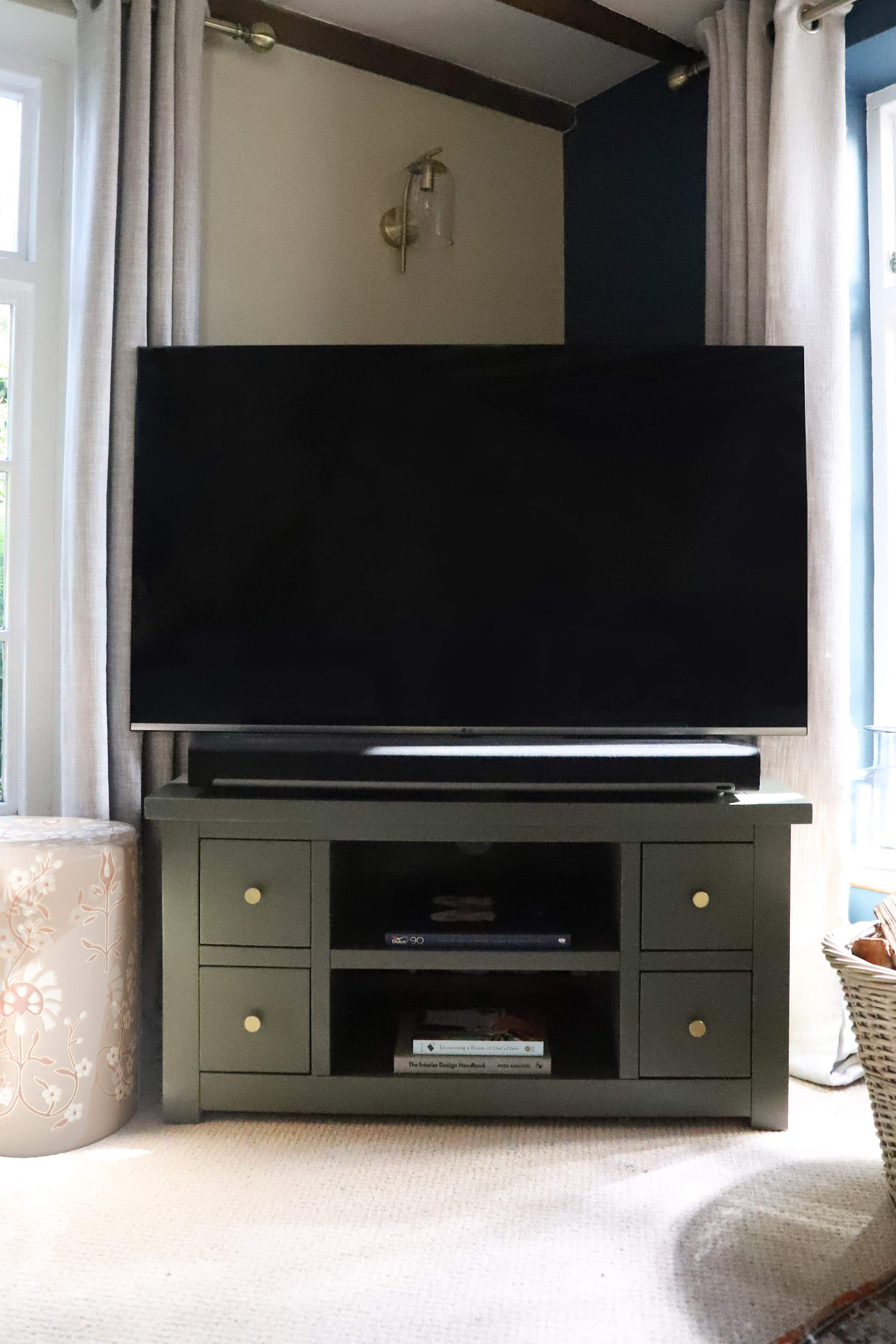
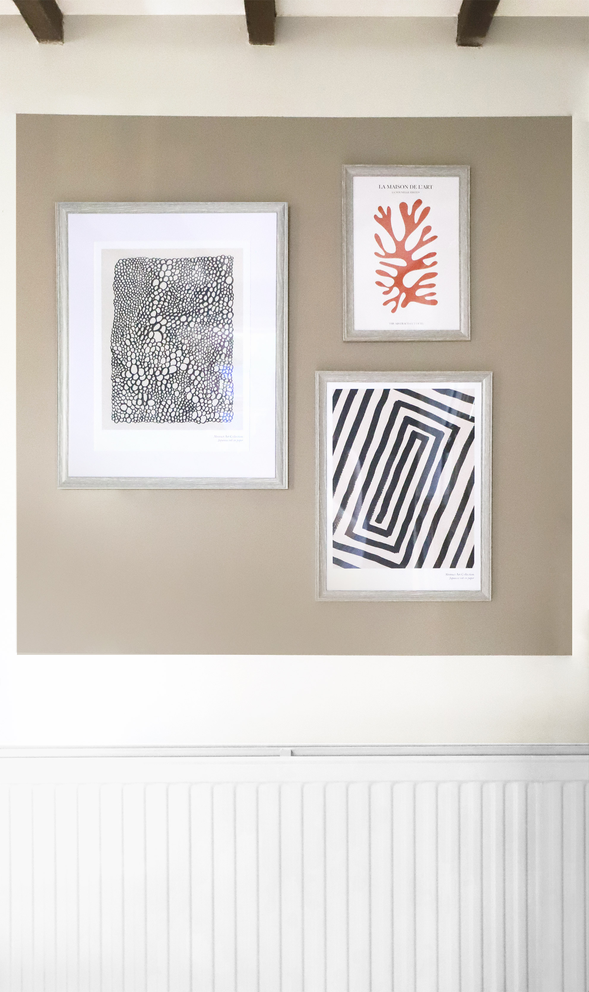
There’s nothing better than standing back and relishing in the satisfaction of a job well done. But it’s important to look carefully at the colour and see how it works in the room. How does it look in the morning compared to the evening? Does it change in different lights? Only once you’ve lived with your palette for a few days can you really understand how to bring out the best in it. Steph says: “Go back to your moodboard and remind yourself of the overall look you wanted to create. Choose furniture and accessories for your space that use the same colour palette and select a prized possession for prime position. I’m a big fan of colour and pattern, so I start with the items that have the biggest impact in the room. In my living room, I chose a patterned rug with reds, reals and olives, which became my ‘anchor’. With this in place, I chose Midnight Teal and Raw Cashmere for the walls, with pops of Pugin Red and DH Slate on upcycled furniture. It’s also important to be sympathetic to the property but not become a slave to it. So, to combat my Cotswold stone walls and quirky beams, I added in more modern, unexpected design touches in accessories and furniture.” She adds: “In order for your scheme to have impact, and avoid looking like a melee of similar colours and textures, include an element of punch. I like to use a colour that either pops or grounds a scheme, such as navy, brown or black, together with a strong graphic pattern like striped cushions. The same method also works with a pop of bright colour in light schemes. In my living room, I’ve added cherry-red bobbin frames and cushions with a geometric pattern in a darker shade. It doesn’t have to be a lot, but it will make the difference between a good and great designer transformation.”
Browse for inspiration
Our carefully selected colours have been expertly curated into different tonal palettes to make finding your perfect shade easy. Divided into light, mid and deep tones, our free printed Colour Card is an intuitive tool to inspire your choices, with complementary hues arranged in harmonious columns and each paired with a beautiful white.
Commit to colour
Not only does Dulux Heritage look beautiful, but it feels gorgeous under your fingertips, with a Velvet Matt finish for walls and an Eggshell with a soft sheen for woodwork – try it today by ordering a Tester or commit to colour by choosing a can. What’s more, we promise our paint will give you the perfect colour with a uniform finish and the coverage stated, or we’ll replace it.
Share your ideas
Share your colour palette on social using #MyHeritageHome and tagging @DuluxHeritage – you could feature on our Instagram and Facebook pages.