Inspiration Article
At home with Heritage: decorate like a professional with the dramatic colour palette curated by interior designer, Christian Bense
‘Considered luxury’ is the signature aesthetic of interior designer Christian Bense – a cross-pollination of contemporary and traditional styles that feels “effortlessly curated” – and his innovative use of colour is one of the simplest ways his expert look can be achieved in your own home.
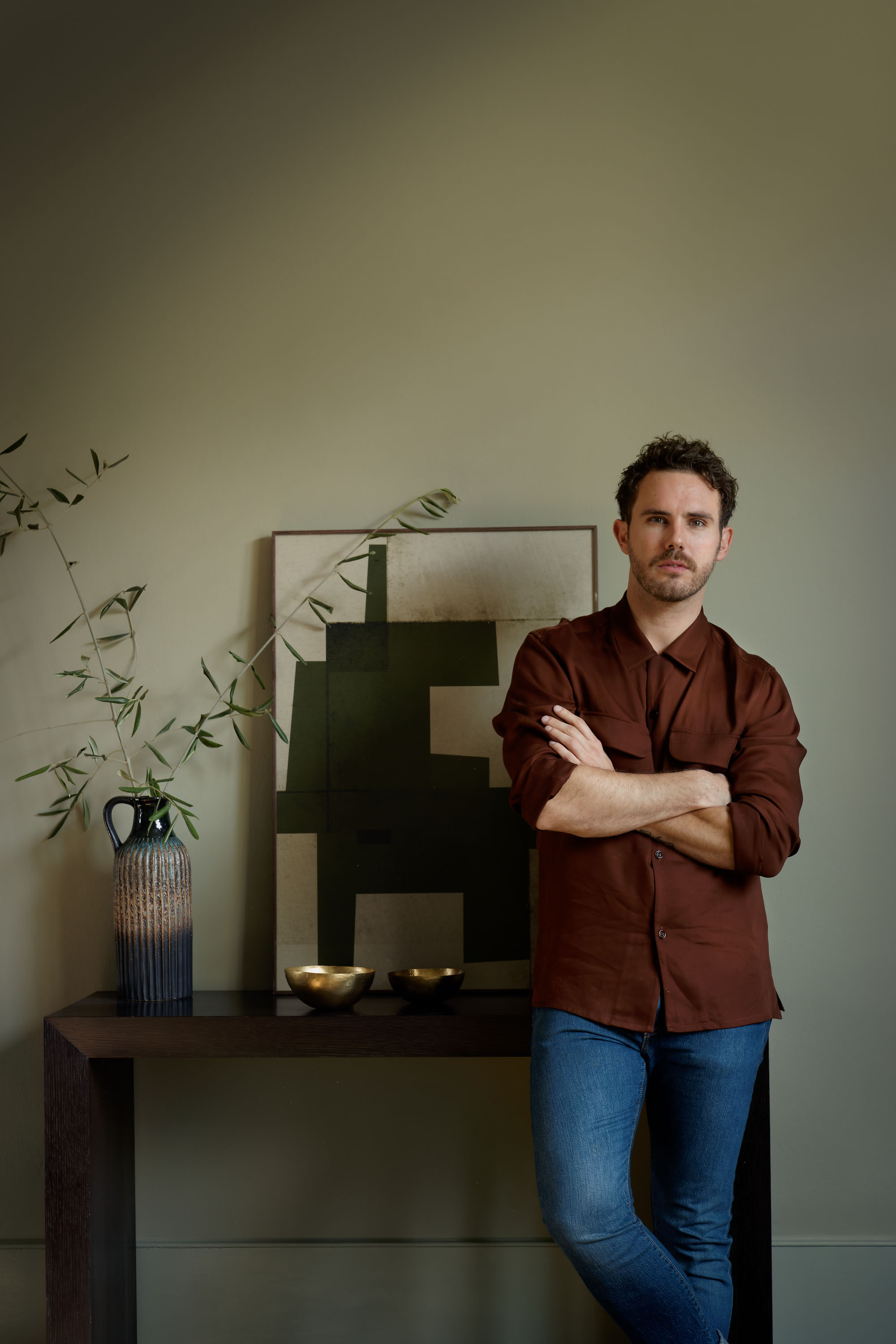
Born in South Africa to a photographer mother and a builder father, creativity runs in Christian’s veins, and his namesake studio in London is testament to his talent with a portfolio of high-end residential and commercial projects. Rather impressively, House & Garden included him in its prestigious ‘30 up-and-coming talents you need to know about’ list, which is quite the accolade. Naturally, Christian was the perfect choice when it came to collaborating with three creatives to curate their own palettes, all using the luxury paint in our Heritage Collection.
The brief was to evoke the sensory quality of our timeless colours – marrying classics from the past with the contemporary hues of today – and pay respect to the tactile nature of our paint, all reflecting his profession and personality. The expert palette he has devised comprises striking deep tones that certainly make an impact.
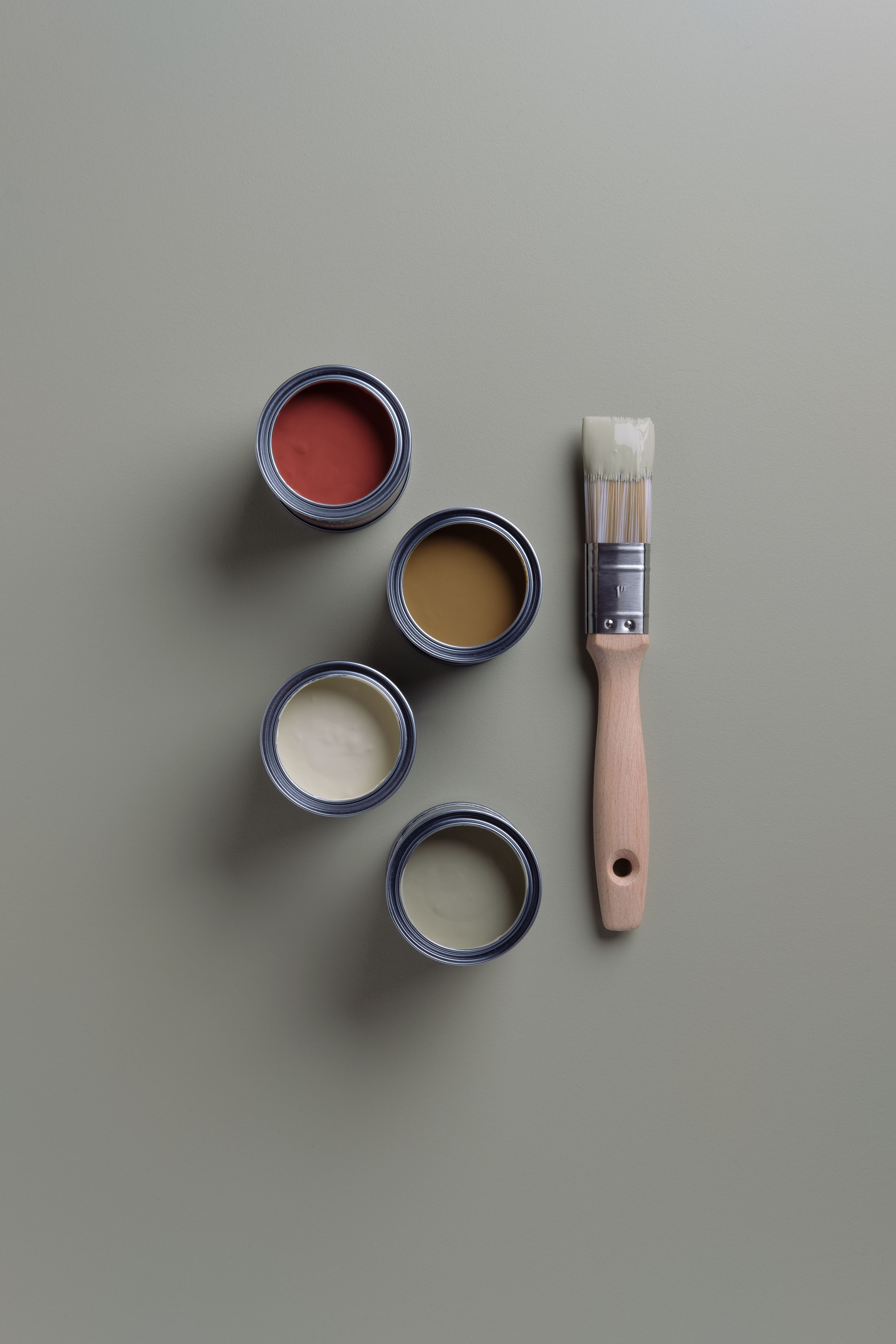
Feast your eyes on the four dominant colours – Masters Gold, Red Ochre, Olive Tree and Green Marl – teamed with a wider palette of four additional hues: Flax Seed, Rosemary Leaf, DH Slate and Midnight Teal. The combination makes the curation as accessible as it is aspirational, meaning it’s easy to recreate, with scope to add your own creative flourish, too.
Christian enthuses of his colours: “Without a doubt, there is a moodiness to my palette. Darker, dustier colours like these lend themselves to a greater level of versatility than lighter shades. They don’t always have to shout – they can whisper, too. My palette is an example of that restraint.”
Of his mustardy yellow, Marianne Shillingford, creative director at Dulux, adds: “We need a bit of sunshine in our lives more than ever right now and yellow gives us an instant slug of joy. Christian’s has a mustard bite that awakens the senses and simply won’t be ignored – this yellow is perfect for bedrooms if you find it hard to get going in the morning, in north-facing rooms that need a bit of warming up, or in elegant sitting rooms where the guilty pleasure of Georgian opulence is truly what you desire.”
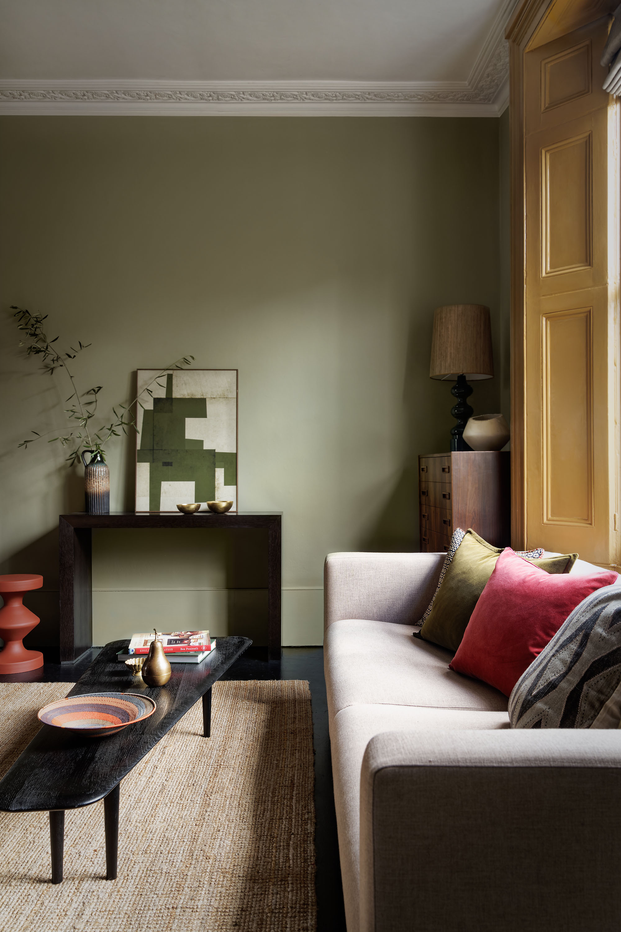
Interestingly, Christian never uses white – in fact, he refuses. The designer explains that he has always been drawn to ‘non-colours’ – the kind they never taught you in school – that tend to sit within a range of tones rather than being strictly one or the other. “For example,” he says, “Olive Tree is more grey than green, and when paired with bronze accents, it feels quite edgy and masculine. Contrast that with Olive Tree teamed with Masters Gold or cream to draw out its green tones and create a softer, calmer mood. When used in design, colours like these really allow one to take any direction you choose…”
The same can be said of the shades Christian has selected for his palette – described by him as “an open door” because of their flexibility. Indeed, the warm, earthy tones spark the imagination, whether used together for a rich and layered look; or simply as bold and characterful statements by themselves. Either way, you’re guaranteed rooms that flow and feel connected. Have fun and experiment – there’s no right or wrong way.
To complement Christian’s colours, think about furniture and furnishings in similarly earthy tones, leaning into the likes of ochre to add warmth and luxury. Team with natural textures in polished wood and buttery leathers and mix in mid-century pieces with more modern styles. Smart and sumptuous, the aim is to achieve a textural and sensory space, though of course, self-expression is key.
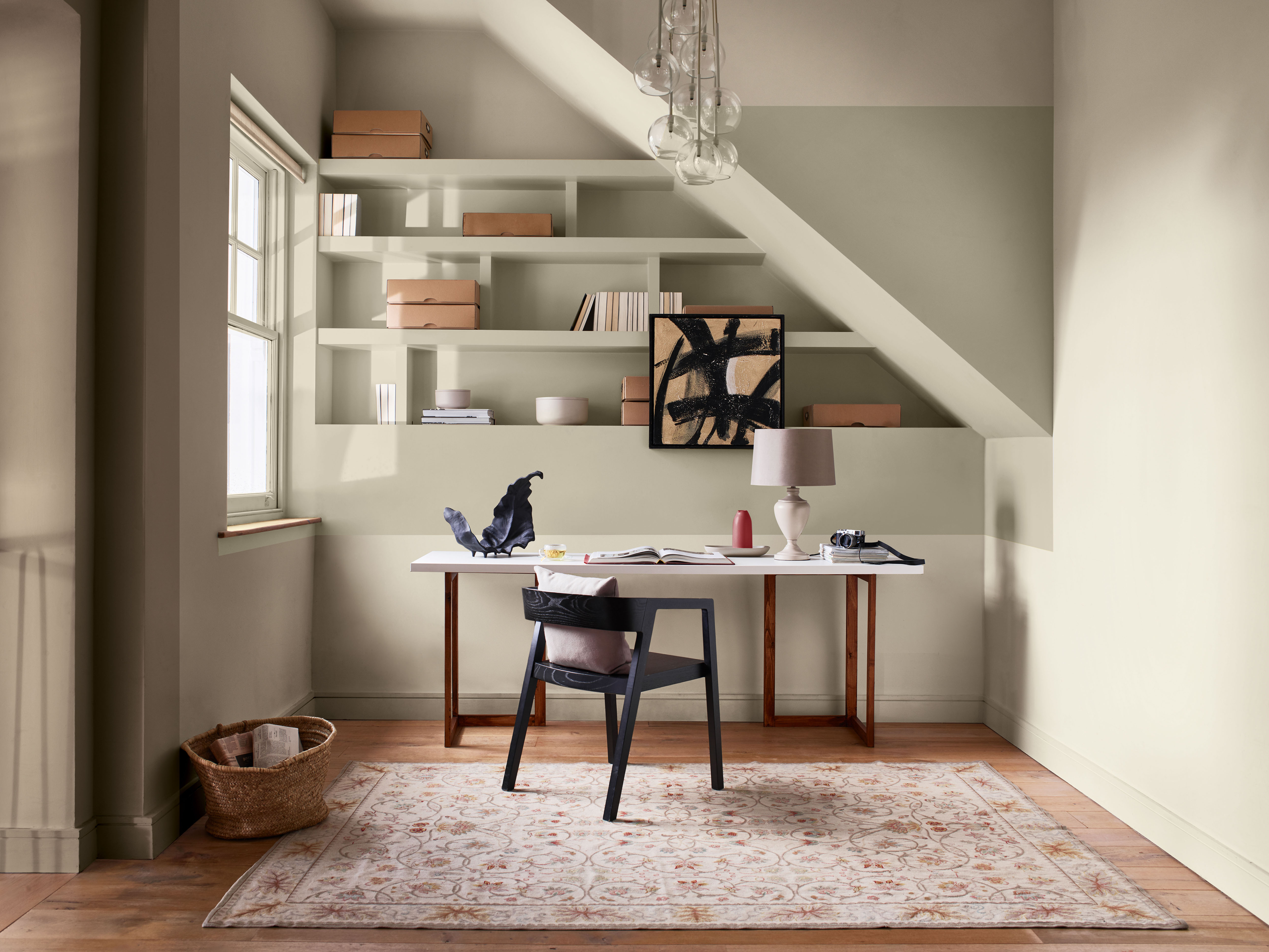
“Use colour as a neutral rather than an accent,” Christian advises. “Most of us use light colours as the base for our rooms, layering brighter shades in art and furniture, so just flip the layering process. Go for bold walls instead and layer in lighter tones to break it up. For example, a room painted in a deep red starts to feel a lot less like a red box once you’ve started to add a lighter coloured sofa, art on the walls and even lighting. In short, don’t just side-line colour as the accent. Use it as the headline act.”
Browse for inspiration
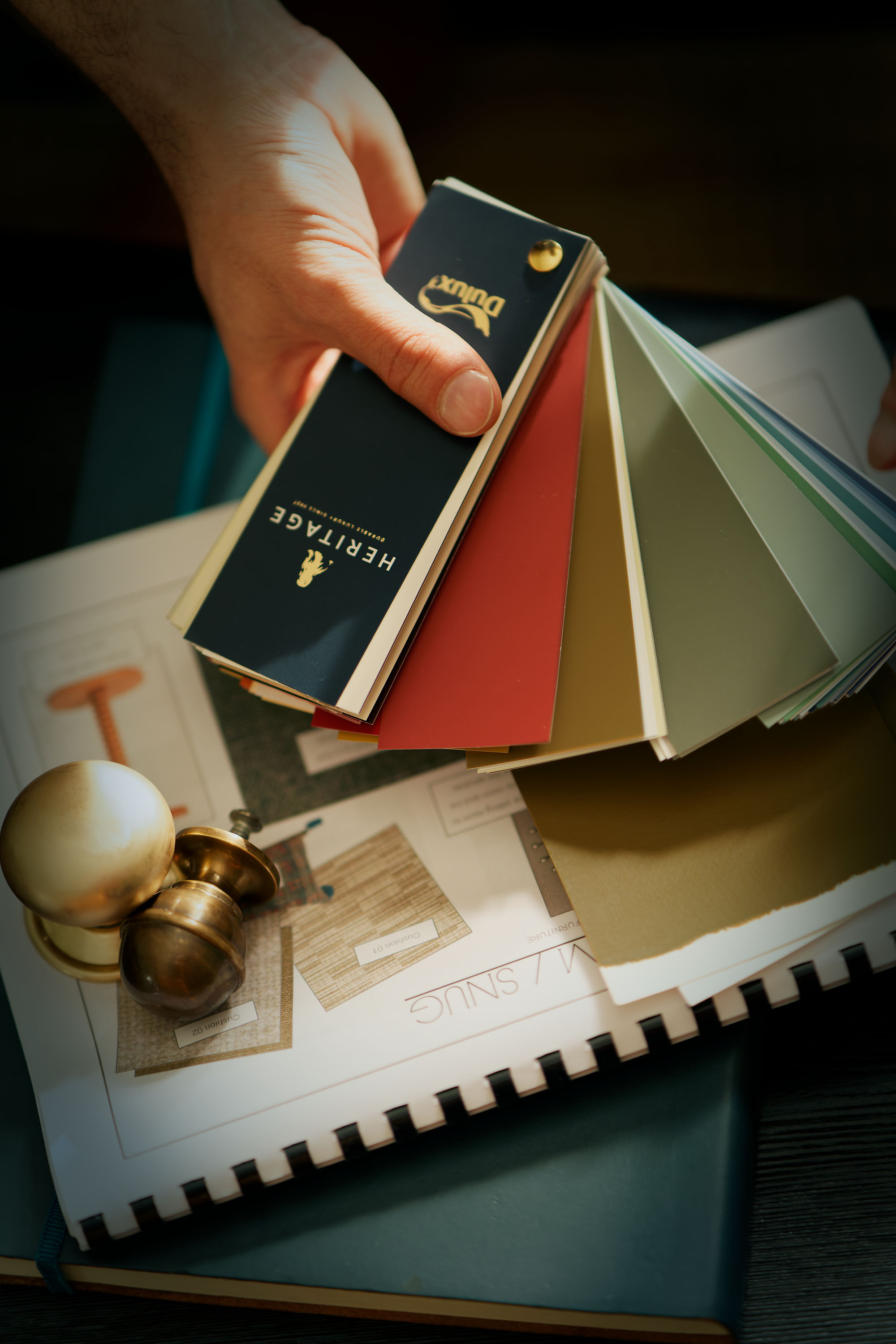
Our carefully selected colours have been expertly curated into different tonal palettes to make finding your perfect shade easy. Divided into light, mid and deep tones, our free printed Colour Card is an intuitive tool to inspire your choices, with complementary hues arranged in harmonious columns and each paired with a beautiful white.
Commit to colour
Not only does Dulux Heritage look beautiful, but it feels gorgeous under your fingertips, with a Velvet Matt finish for walls and an Eggshell with a soft sheen for woodwork – try it today by ordering a Tester or commit to colour by choosing a can. What’s more, we promise our paint will give you the perfect colour with a uniform finish and the coverage stated, or we’ll replace it.
Share your ideas
Share the colour palette you have curated to reflect your own personality on social using #MyHeritageHome and tagging @DuluxHeritage – you could feature on our Instagram and Facebook pages.