Inspiration Article
Our hero colours of 2023: the ultimate cheat-sheet
Our hero colours of 2023: the ultimate cheat-sheet
Calling all professionals: the experts at Dulux Heritage have curated an exciting palette of hero colours that will define how you decorate in 2023. Selected from the 112 existing shades within the Heritage Collection, they’ve been cherry-picked to capture our national mood and the cultural trends, while coming together to create timeless schemes. From a glamorous green to a rich red and a breezy blue, there’s something for every taste and space, providing a spectrum of colours for you to choose from. With our beautiful palette, the power of transformation really is in your hands, changing not just spaces for clients, but how they feel in them. We call it ‘panting by feeling’, and that’s how you can explain it to your customers, whether they want to feel energised, relaxed, or anything in-between. Here, we show you how to use and recommend our palette for your next project – consider it your cheat-sheet.
How to explain how colours were curated
To explain the colours within our hero palette to your clients, you’ll need to understand how they were curated. Marianne Shillingford, our creative director, heads up the annual selection process when the 112 shades in the Heritage Collection are put in the spotlight to see what colours are most relevant to how we’re feeling as a nation right now. This year, Marianne and her expert team curated a flexible palette to reflect truly hard-working homes – where the calming living rooms need to double-up as motivating home offices, for example – to accommodate shifting and expanding physical and emotional needs. Therefore, these shades are some of the most versatile you’ll ever have the pleasure of recommending, from Red Ochre working as well in a dining room as it does a bedroom, to Country Sky being as much of a match for a bedroom as it is a study. Brilliantly elegant and economical.
As well as offering flexibility, the colours were also chosen for their connection to nature – a quality that creates peaceful, calming homes in a chaotic world. They enable us to paint our own personal sanctuaries while evoking the times, places and stories that are precious to us. Perhaps Mallard Green reminds you of a relaxing walk you regularly enjoy? Or maybe Brushed Gold recalls a restorative beach you once visited? Encourage customers to pick colours on a personal level – like Marianne and her team does at Dulux Heritage – and form an emotional connection to their spaces. The palette can be used to push buttons that transport them to places and times they never want to forget. Use evocative language to inspire them.
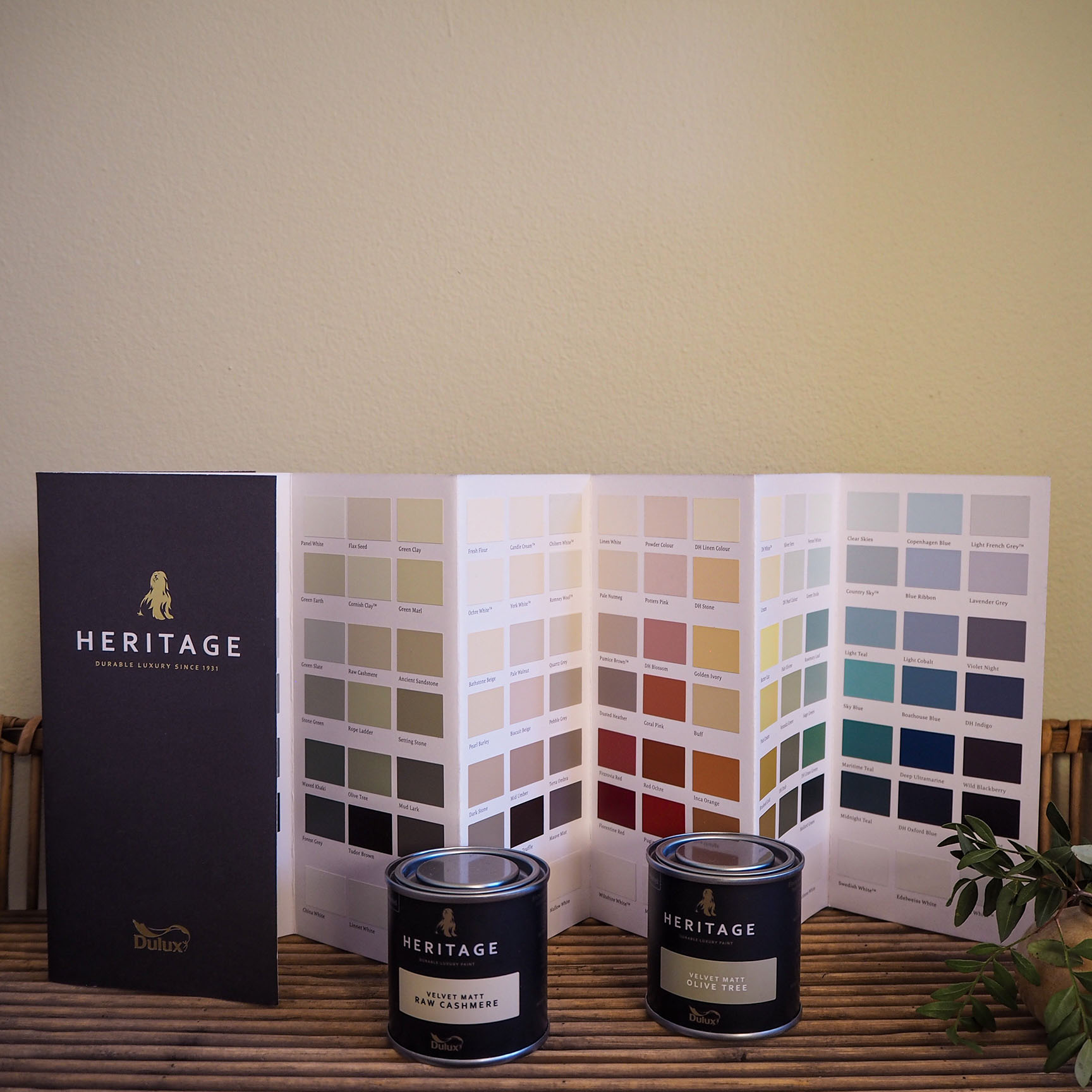
Your go-to colour glossary
Sometimes, the hardest thing about recommending a colour can be describing its qualities and effect on a space, not to mention the room it works best in. Fear not: Nicola Holmes – our skills and development consultant – dips into each paint to help you explain the palette to your customers. If it’s not here, it’s not worth knowing.
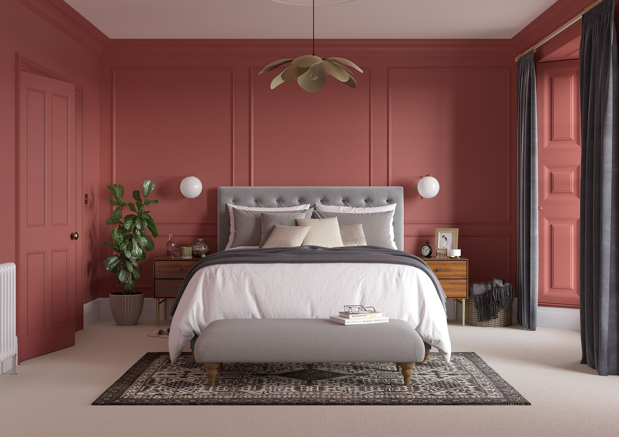
Red Ochre
“Red Ochre is a rich, spicy and powerful colour that creates warm, snug and cosy spaces. It’s on the orange side of the colour spectrum with an earthy terracotta feel. Use in rooms where your customer wants to create impact and a feeling of warmth, like a blanket that wraps around them, such as a living room or dining room.”
Pale Walnut
“Pale Walnut is a versatile, subtle and delicate colour that creates fresh, warm and modern spaces. Small amounts of yellow and red make it extremely versatile. Use as a warmer alternative to white throughout the home, especially in bedrooms for its delicate nature.”
Mallard Green
“Mallard Green is a grand, luxurious and natural colour that creates harmonious, stable and grounded spaces. It brings the mystery of a forest to life. Use in spaces connected to the outdoors for continuity, or in bathrooms or living rooms. It looks spectacular painted on a ceiling, too.”

Country Sky
“Country Sky is a fresh, delicate and airy colour that creates uplifting, tranquil and restful spaces. Undertones of grey make it more muted than other pale blues. Use in rooms that receive plenty of natural light to balance out its coolness.”
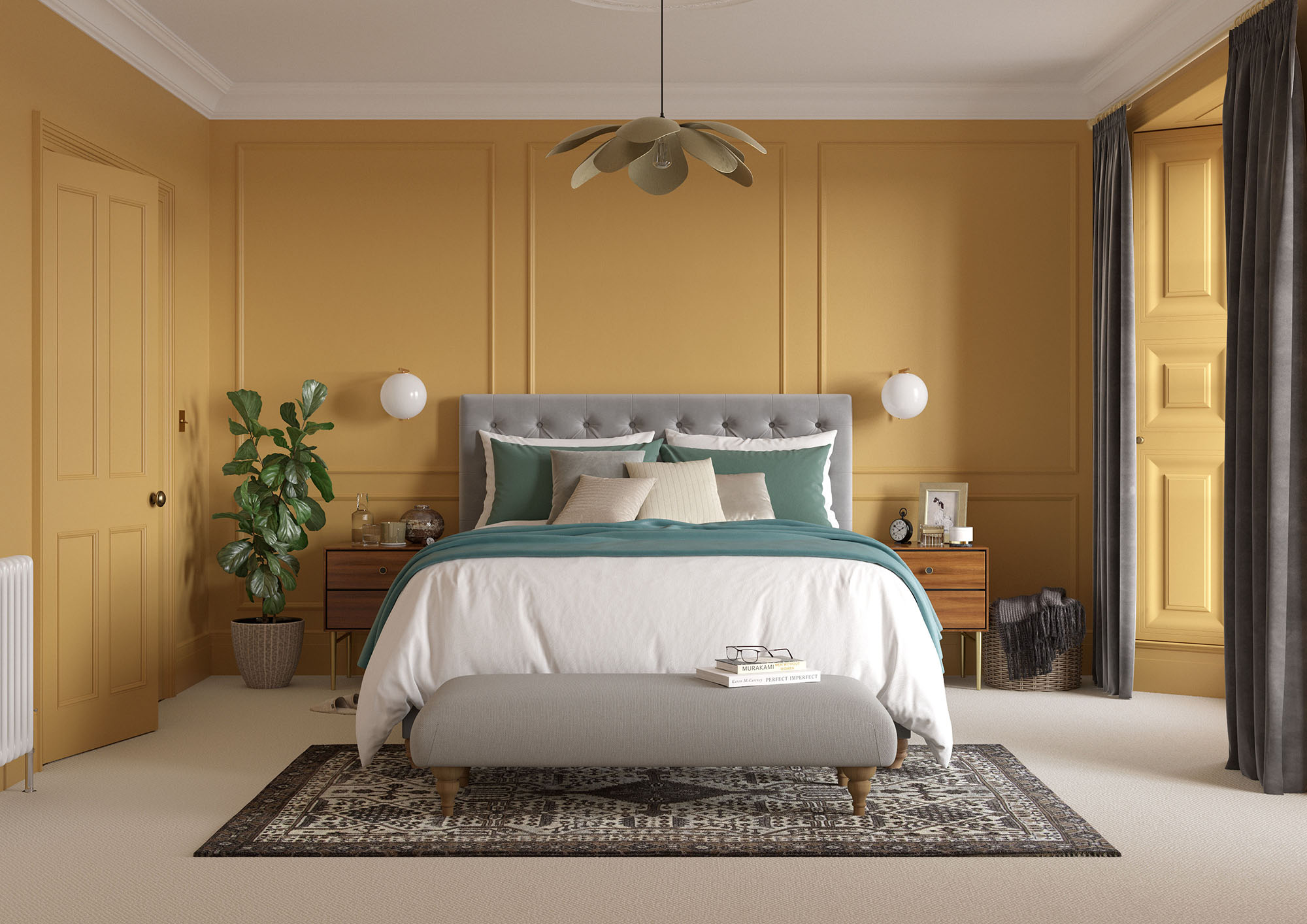
Brushed Gold
“Brushed Gold is an opulent, precious and elegant colour that creates rich, luxurious and warm spaces. Reminiscent of old burnished gold or brass. Use to create drama for customers in their kitchens or dining rooms, or to brighten up spaces that lack natural light. Think of it as a golden, glowing sunset.”
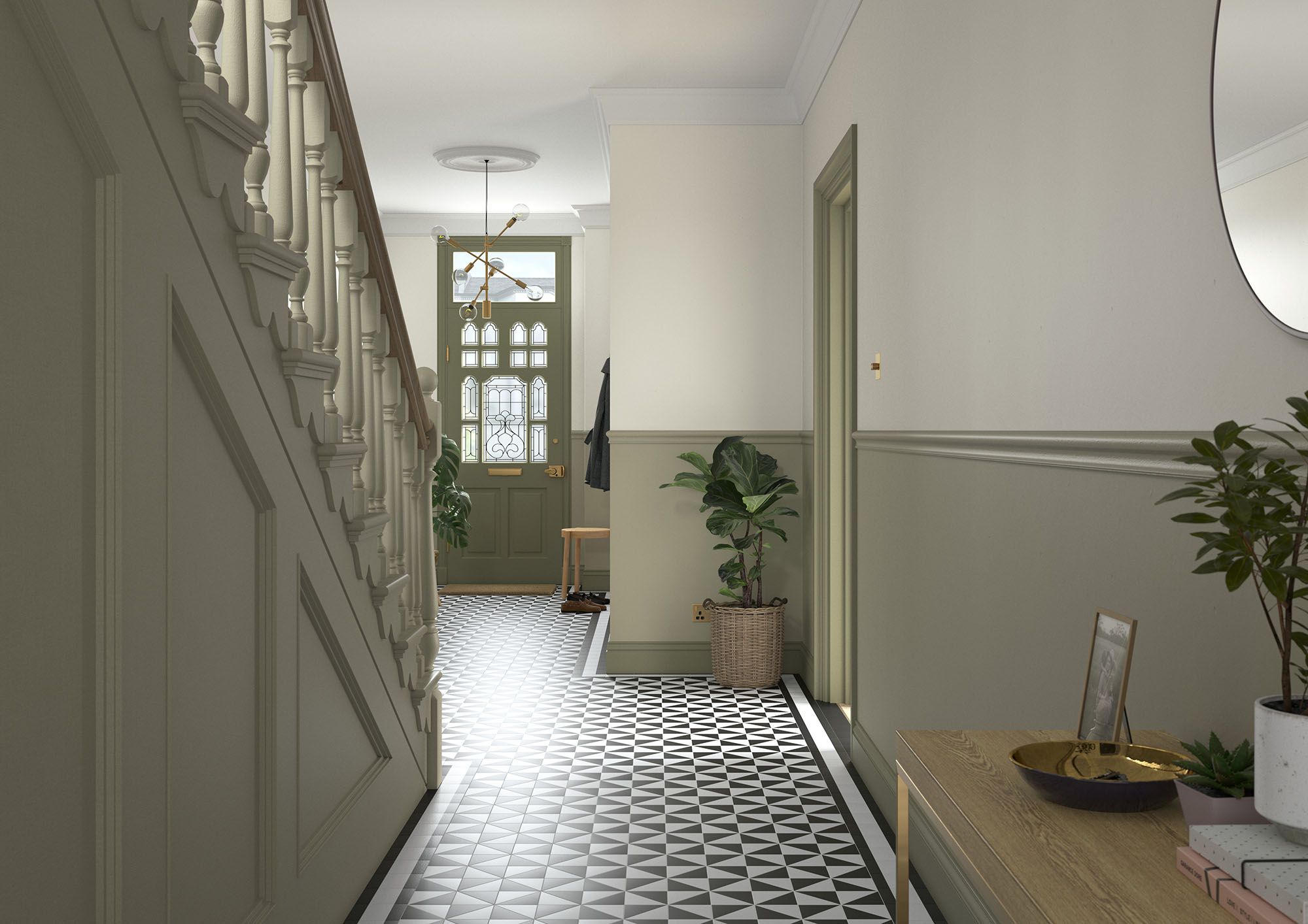
Olive Tree
“Olive Tree is a relaxed, warm and balanced colour that creates soothing, calming and restful spaces. A muddy green that feels sophisticated. Use in bedrooms, kitchens and bathrooms for beautifully balanced spaces.”
The trend to talk about
“Bringing the outside in is a trend I’m seeing more of,” says Nicola, “perhaps because Mother Nature is so good for our health and wellbeing. Why don’t you suggest trying the trend to your clients? An easy way to recreate is by painting Olive Tree on the walls, trim and ceilings to blur the lines between the different surfaces. This creates a seamless and natural space that removes the boundaries between the view outside of the window and the décor inside the house. The ceiling, too, seems to disappear into the sky! For bolder customers, a colour-drench in Mallard Green also taps into the trend, albeit in a more confident way.”
Try our tools
“For more information and inspiration, visit the Heritage website to explore the hero colours further, read a fuller description of each – we call them ‘Tasting Notes’ – and visualise how they look within different spaces (helpful room-set imagery brings everything to life). That’s not all, either. Once you’ve got a handle on hues, you can direct your customers to download the Dulux Trade Expert app from the App Store or Google Play too see all the colours in one place and discover what combinations work best. For those less digitally-savvy, our Dulux Heritage Colour Card or Dulux Heritage Fandeck also contain all 112 colours and make choosing fun, stress-free and tangible. Consider them essential tools of the trade.”
Commit to colour
Not only does Dulux Heritage look beautiful, but it feels gorgeous under your fingertips, with a velvety matt finish for walls and an eggshell with a soft sheen for woodwork. Formulated with premium quality pigments, Dulux Heritage Velvet Matt guarantees excellent depth of colour for walls, while specially-blended clay ensure effortless application; mixed for use on wood and metal, Dulux Heritage Eggshell provides a stunningly smooth finish, while being reassuringly hard-wearing. Both are water-based for a more sustainable paint. Why not try Dulux Heritage today by ordering a tester or commit to colour by choosing a can?
Share how you and your clients use our hero colours on social using #MyHeritageHome and tagging @DuluxHeritage – you could feature on our Instagram and Facebook pages.