Inspiration Article
Colour Confidential: Light Vs Dark Colour Schemes
Choosing a side is never easy, even when designing your dream home. As with most things, there are benefits to decorating with both light and dark colour schemes.
Light colour schemes tend to be more versatile, and therefore, a natural pick for most people. They are brilliant at accentuating a sense of space and giving a room an air of sophistication. But don’t write dark colour schemes off just yet. Remember, the bigger the risk the bigger the reward. Darker colours can instantly conjure up a moody and dramatic atmosphere. And when done right, they can also create a cosy, cocooning feel.
Now, if you want to add a little luxury to your space, both colour schemes fit the bill. Especially those found in the Dulux Heritage collection.
Still struggling to decide between the two? Ask yourself these three questions…
What is the purpose of your room?
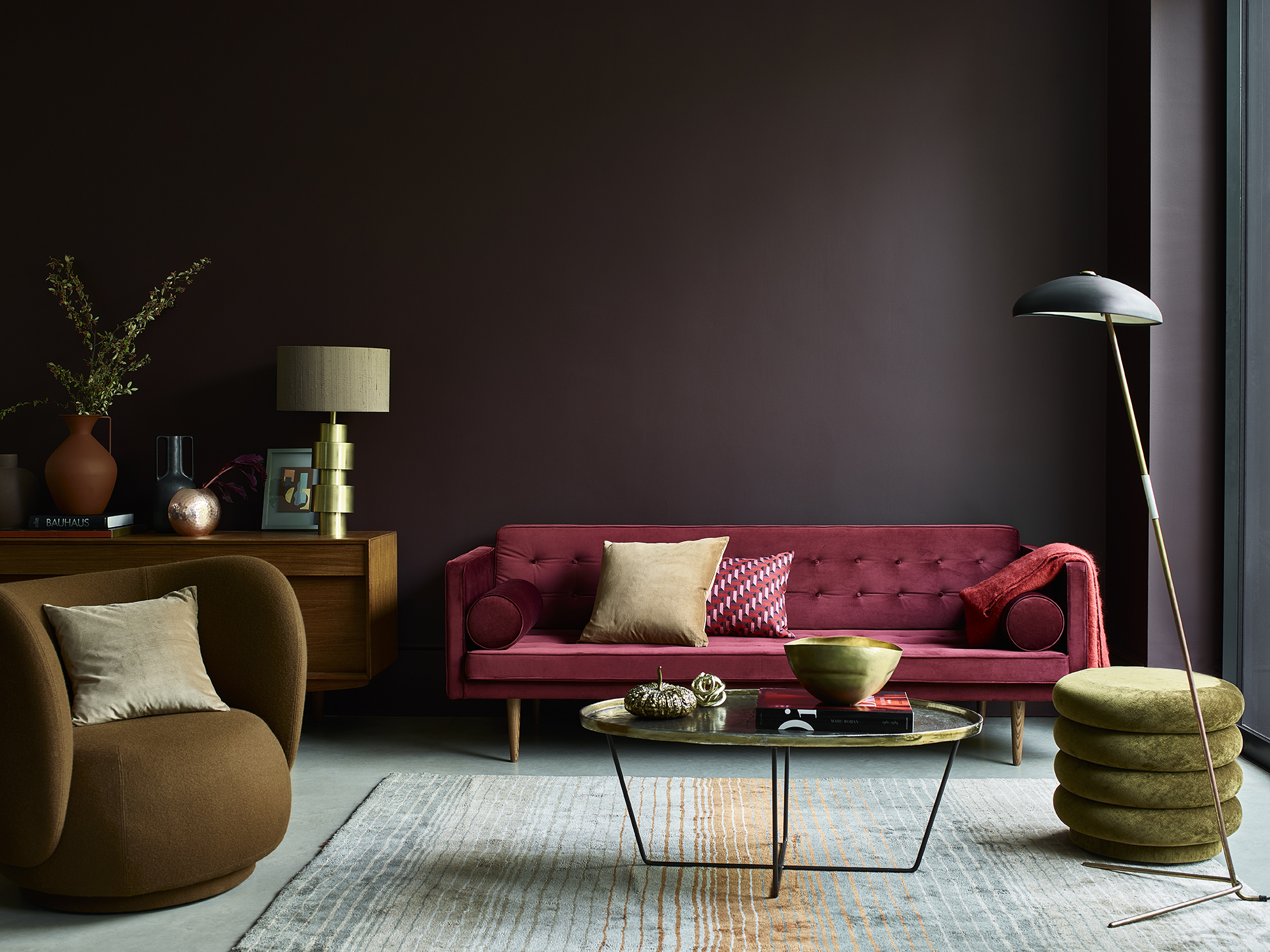
Say you’re updating your living room. The first thing you should consider is how you’re going to use the space. If you want the room to be your warm winter oasis, then a dark colour palette is the ideal choice. Immerse yourself in an indulgent shade such as Cherry Truffle for a sense of intimacy and comfort. Then ramp up the cosiness by layering your room with rich colours. We styled this dark red living room with a classic wooden cabinet and a red velvet sofa to create a cosy, yet luxurious look.
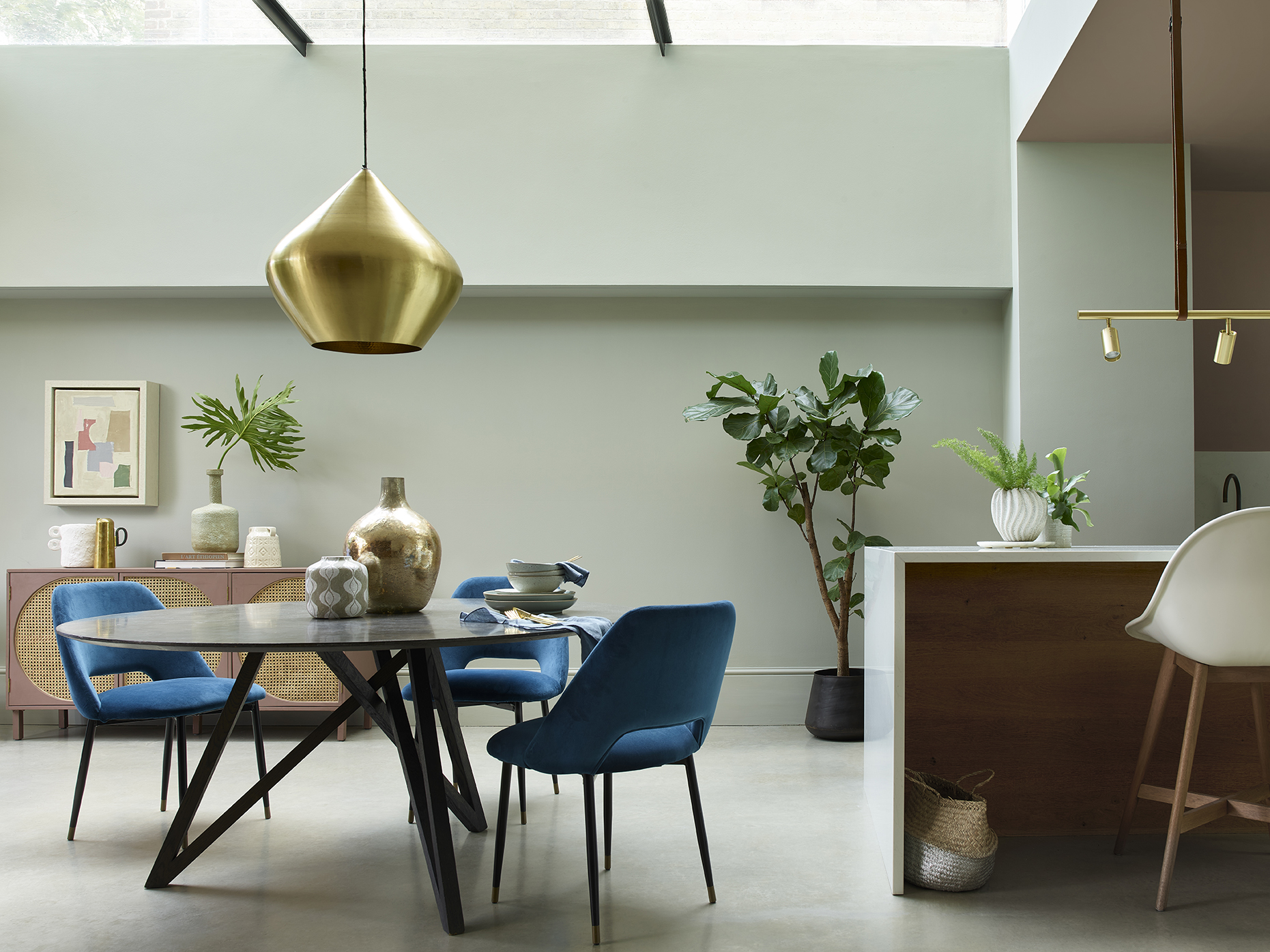
Or if you’re playing host this party season, a bright colour palette can help transform your living room for entertaining. Stone Green is a beautiful neutral that provides a fashionable and sophisticated backdrop for any cocktail or dinner party. Bring your green living room or dining room to life with luxe metallics. We dressed this space with subtly shimmering vases and a striking gold ceiling light.
How much light does your room receive?
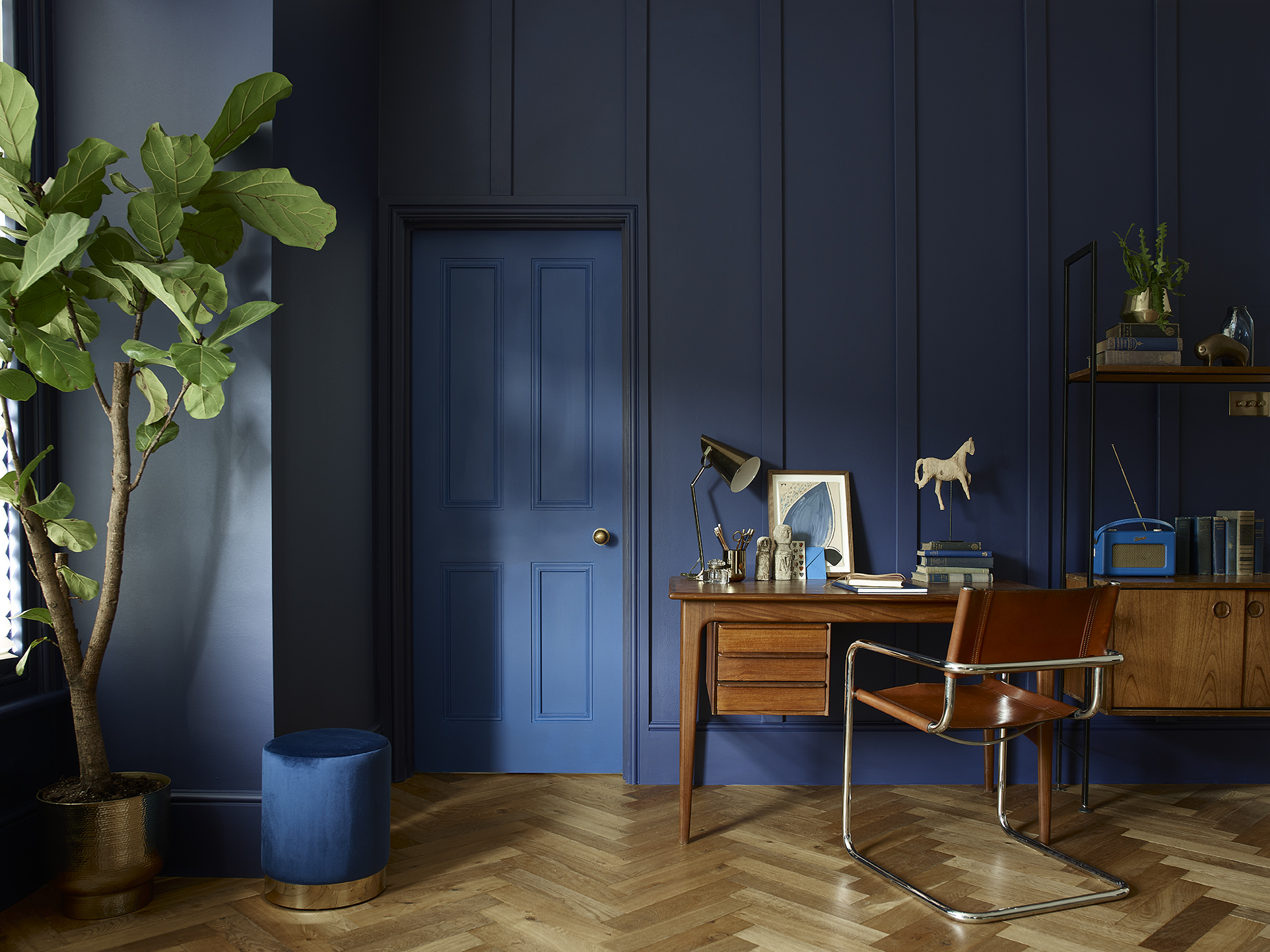
Another factor that should influence your decision is the direction that sunlight enters your space. If you have a north facing room, it’s going to naturally feel darker and colder. But this isn’t necessarily a bad thing. Why not embrace this feeling and choose moody shades of blue paint? A brooding hue like DH Oxford Blue is a timeless choice that makes any room look more grandiose. With Deep Ultramarine on the door, we styled this home office with mid-century style furniture and a retro radio to complement the dark colour palette.
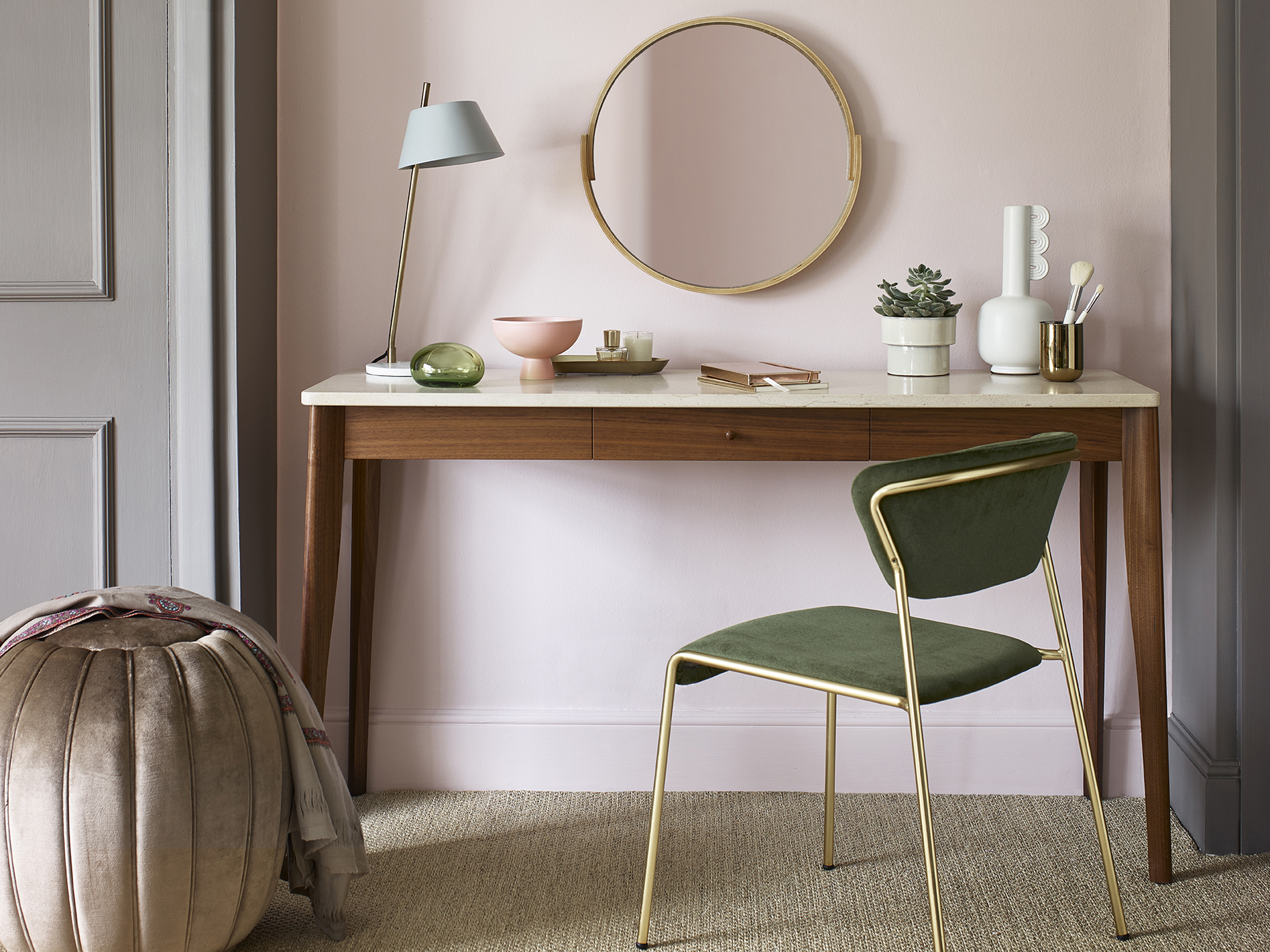
South facing rooms are suited to most colour schemes because they get lots of warm, natural light throughout the day. If you want to enhance the light spilling in, try softer shades of pink paint like Potters Pink. It’s a breath of fresh air that can brighten any room in your home. We used it in this pink bedroom, combined with Mud Lark for an extra layer of warmth. Then furnished the dressing area with feminine shades, such as glittery golds, lush greens and on-trend earthy tones.
What mood are you trying to create?
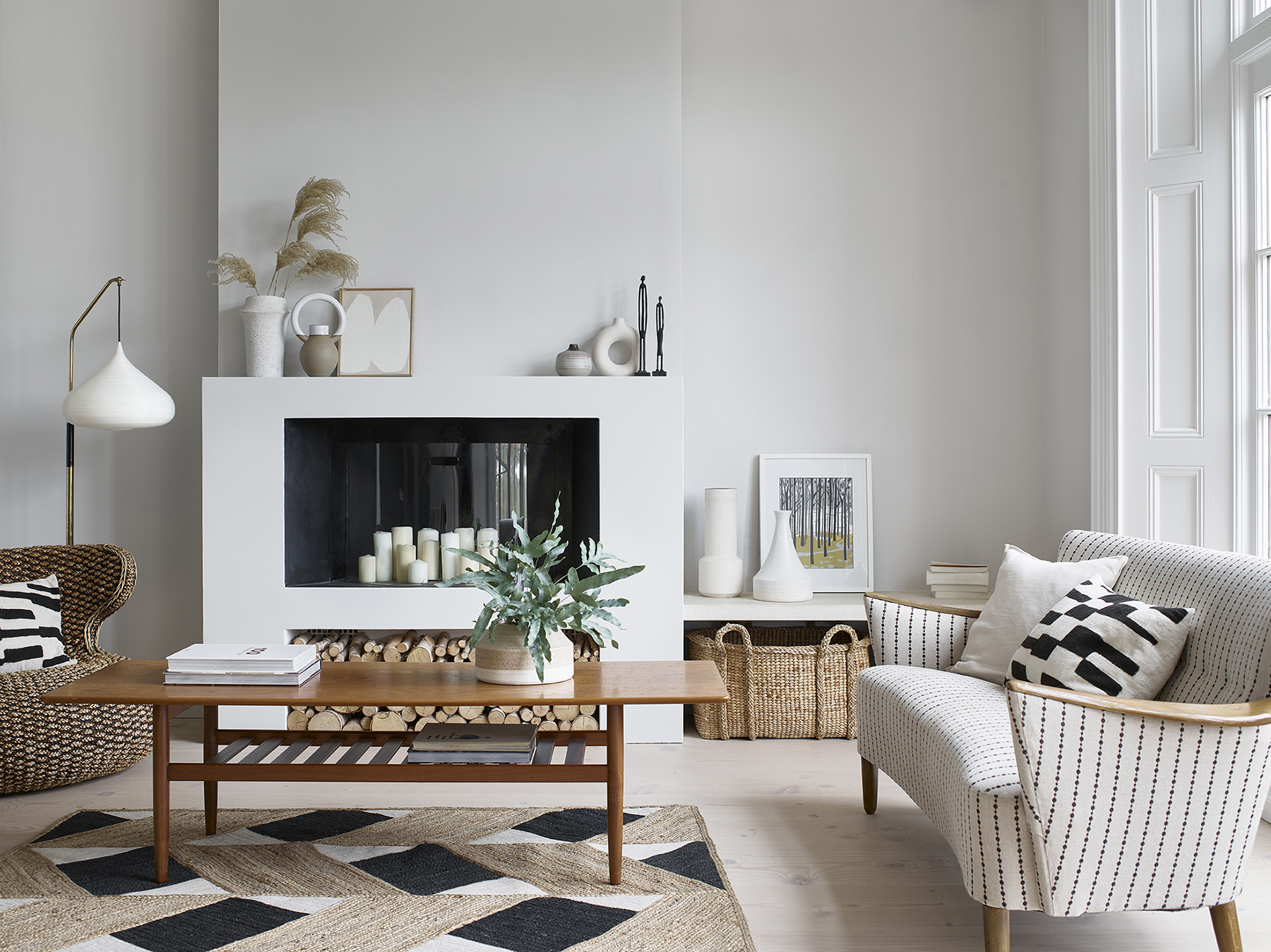
Last but not least, consider the mood you want to set. Paint colours have the power to create all kinds of moods. If you want to create a light and airy atmosphere in your home, our beige living room ideas are a great source of inspiration. For example, a pale, immaculate neutral like Romney Wool can refresh your walls and clear your mind. Build on the mood with rustic textures, such as rattan baskets or a woven rug. The result? A refined and relaxing Scandi living room.
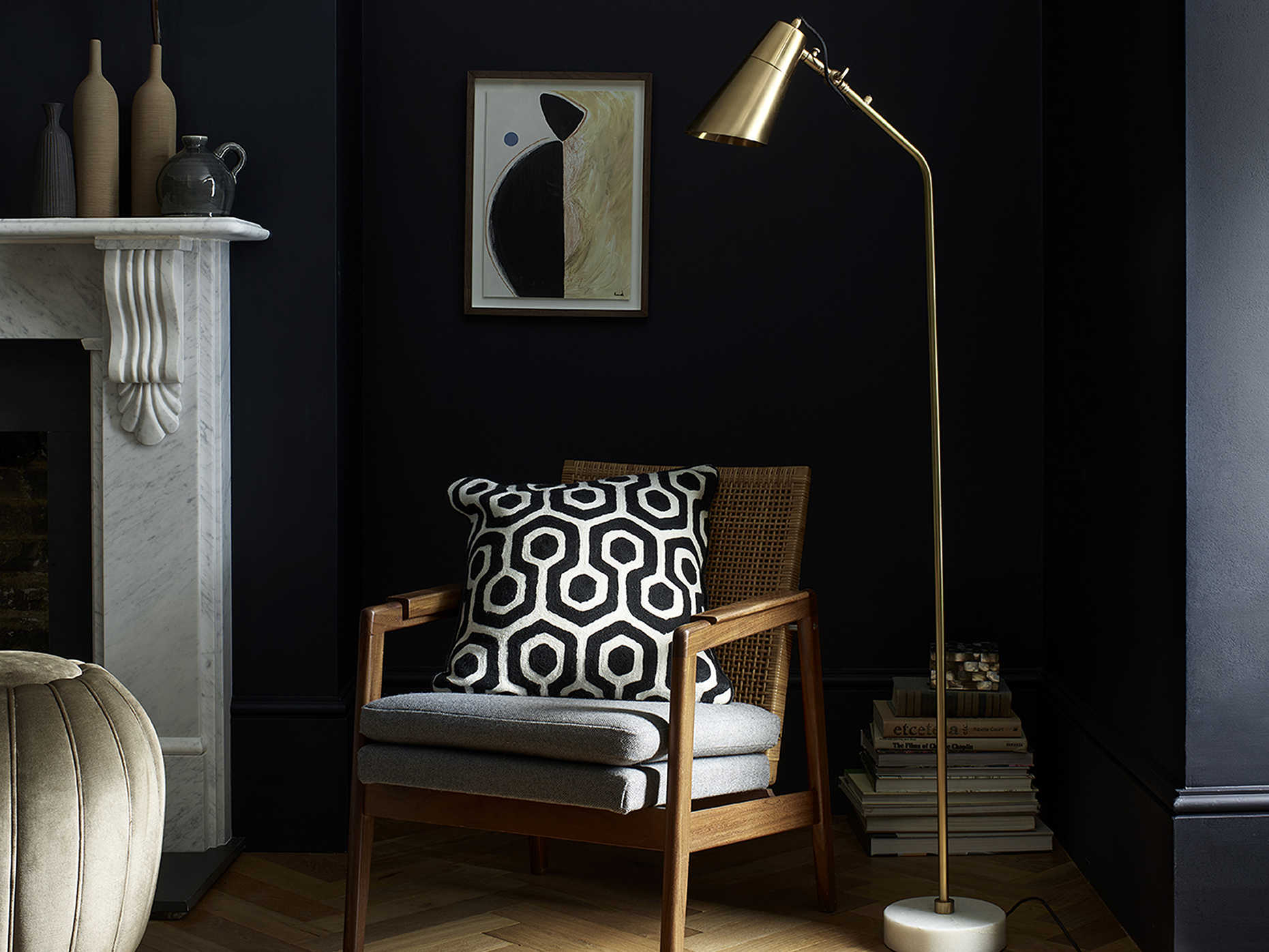
Or do you want your space to feel more intense and seductive? In which case, choose a dark colour palette. Ravens Flight couldn’t be a better fit. The shadowy shade brings drama and depth to the corner of this sitting room. All that’s left is to fill the nook with accessories and furniture that complement the ambience of this living room colour scheme. A chic, comfy armchair and tall reading lamp creates the perfect spot for getting lost in a good book.
Whether you’re leaning towards light or dark colour schemes, our heritage hues are organised by tone to make it easy for you to pick your shades. Explore them here or visit our social channels for more inspiration.
Remember to share your Heritage colour story with us using #MyHeritageHome and tagging @duluxheritage. You could feature on our Instagram and Facebook!