Inspiration Article
Masterclass: Nailing the Ultimate Neutral
While grey may still be having its day, white is the undisputed comeback kid, with the trend for simplicity continuing to gather momentum in a complicated world. As the ultimate neutral, white always looks clean and uncluttered, creating a blank canvas for colour and quirk elsewhere. It also works wonders to open small spaces and make rooms feel lighter and brighter. Plus, it’s one of the most versatile shades in the spectrum, pairing with any other hue and in any style of house. But the best bit? It’s rarely as pure as the driven snow, as most whites feature undertones of other colours, meaning spaces needn’t feel cold and clinical. Here, we reveal how to get white, right…
Understand your undertone
While undertones in whites are often subtle, they can create the biggest impact in an interior, so it’s worth nailing them from the offset. From cool (Lead White™, Swedish White™) to warm (Ash White™, Roman White™), many have hints of grey, blue, pink or even yellow in them, meaning it can be hard to tell pure from pigmented. Luckily, the whites in the Heritage collection are easy to choose from in our free printed colour card and on our online colour wall, as we’ve teamed them with complementary colour groups, and similarly-toned shades. Not only does this mean that you can see at-a-glance which whites are cool or warm – according to the colours that sit above them – but it also means that you can select them safe in the knowledge that they will coordinate effortlessly with the shades in the same column. For an even deeper exploration of a white, click on the digital swatch to read an evocative description that will explain what pigments it contains, and how that white could work.
White for the light
It’s a general rule of thumb for choosing any colour, but even more so when thinking white, that you select your shade according to the light in the space. For example, it’s best to avoid cool whites in north-facing rooms, as they enjoy little sunshine and need warming up to avoid feeling unwelcoming, while pretty much anything goes in south-spacing spaces – although cool whites will counteract the yellowness of the sunshine. Light just right? A neutral white, such as Indian White (pictured), all the way – flexible and pale with an optimistic feel. To get it right first time, order a Tester Pot online to trial on your wall, and remember to check in on the sample at different times of the day to catch it in changing light, from dusk to dawn.
Let’s talk trim
From the skirting to the doorframes, don’t forget to consider the colour of your trim when working with white. Once considered a faux-pas, as it can potentially wash a room out and lose the character of period detailing, matching is now bang-on trend as it has the power to hide unsightly skirting while adding height to a space when done properly. Alternatively, pick out trim in a punchy colour – perhaps a dominant shade in furniture and furnishings? – to draw attention to the white on the walls and focus the eyes upwards. What does work well is layering the same or similar whites in varying finishes to create depth and dimension: Velvet Matt on walls looks and feels luxuriously smooth in contrast to Eggshell for woodwork with its low-sheen finish.
Flow-through colours
As with our advice in creating a cohesive colour scheme, it’s essential to consider white in context of the colours in your other rooms, helping to create a seamless look throughout the home. The same rule applies as with any other shade: select a white that is the same tone as in adjacent zones, whether cool or warm, as the secret is in the sympathy between your white and the other spaces.

3 ways with white
1 White can create a wonderful canvas against which to hang cherished artworks or family photos (such as Indian White, above). After all, there’s a good reason that galleries use it in its purest form. Offset against black, colourful or bold frames for best results.
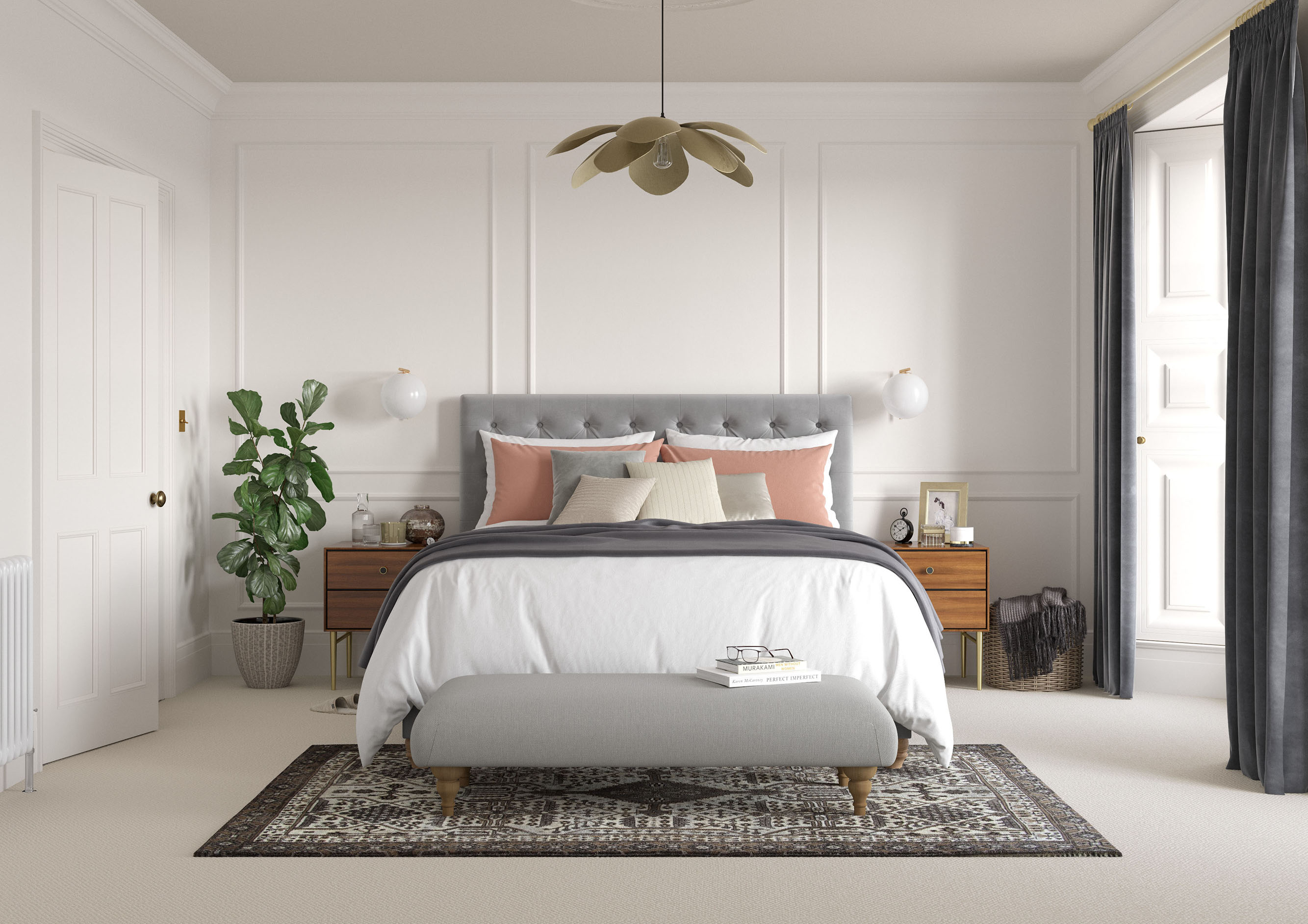
2 Consider white for a bedroom as it’s conducive to rest and relaxation and is sure to cocoon with its enveloping properties and soothe you to sleep. Paired with crisp white linens, for a hotel-at-home feel, it’s positively dreamy…
3 If you’re white-washing multiple rooms, or you whole house, pick a favoured shade and stick to it for a seamless and connected look. Interest can be created through different finishes rather than colours together with bolder accents on woodwork and in furnishings.
Commit to colour
Not only does Dulux Heritage look beautiful, but it feels gorgeous under your fingertips, with a velvety matt finish for walls and an eggshell with a soft sheen for woodwork. Try it today by ordering a tester or commit to colour by choosing a can.
Share your stylish ways with white on social using #MyHeritageHome and tagging @DuluxHeritage – you could feature on our Instagram and Facebook pages.