Inspiration Article
Masterclass: How to create a coherent colour scheme
Ever wondered what works so well about the seamless décor found in stylish hotels and restaurants? The secret is a considered flow of colour throughout the spaces – usually created by an interior designer – that look at once individual and connected. It’s hardly surprising, then, that recreating a similarly cohesive scheme at home is one of the main reasons people hire a professional. After all, tying colours together across different rooms with varying purposes can be tricky, even for the experts. But, while many aspects of decorating are an art form, colour is more of a science, and with a little of our colour expertise, you can easily create a scheme that feels coherent. Just ensure you think about how you want your house to feel to infuse a little emotion and personality alongside its looks. Here, we spill the secrets the industry has been desperately trying to keep under wraps…
Work with what you’ve got
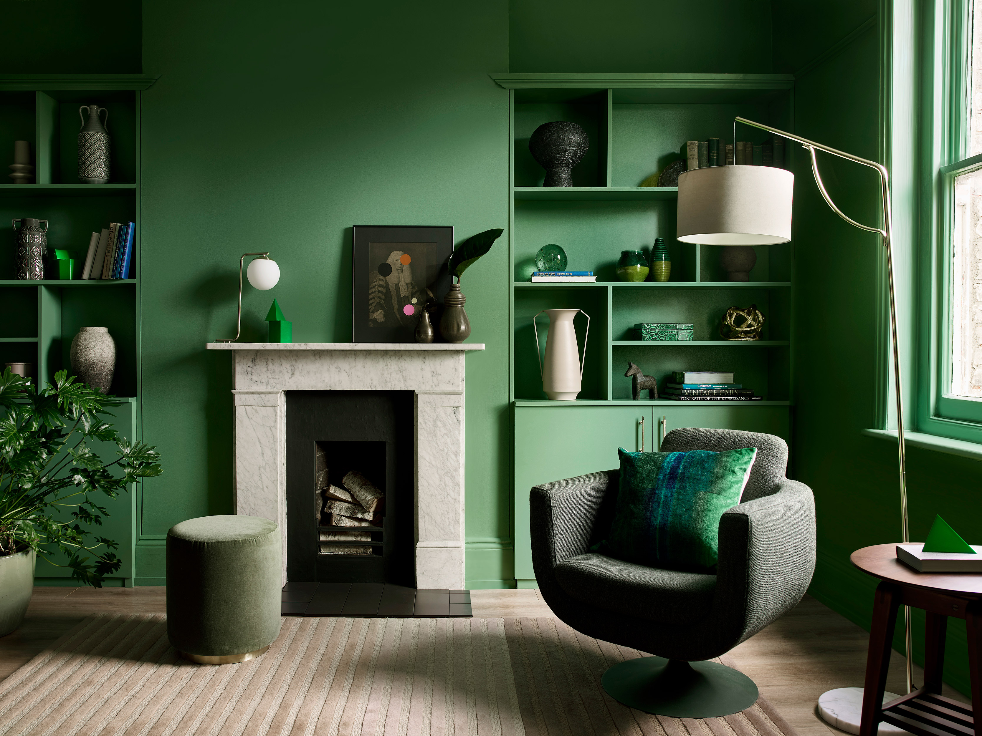
The first step in planning a cohesive colour scheme is identifying what aspects of your home you can’t change. From period features to hardwood floors, unless you’re working with a completely blank canvas such as a new-build, there’ll always be fixed details you’ll need to incorporate rather than ignore. So, bring in a suite of supporting colours to complement these existing shades: mahogany floorboards really pop against light walls such as Copenhagen Blue or Silver Fern; and a natural stone fireplace is showcased beautifully with a contrasting surround in something like DH Grass Green or Maritime Teal. It’s very rare that anyone will be starting completely afresh so embrace what already exists as the basis for your rooms.
Find inspiration in furnishings
From an oversized rug to an opulent piece of art, seek inspiration in the beautiful belongings you have collected over the years, and could never bear to part with. Identify the colours in these pieces and let them guide you to a complementary palette. After all, a designer has already done the hard work and selected hues that work together, so use these to your advantage. Soft furnishings in natural colours (create, beige, brown) and materials (wicker, jute, wood) are offset spectacularly with a similarly neutral colour such as Pebble Grey or Biscuit Beige. After you’re done with the initial decorating, whenever you go shopping for trinkets and treasures to style things up, stick to colours that build on your palette for even stronger cohesion.
Stick to the rules
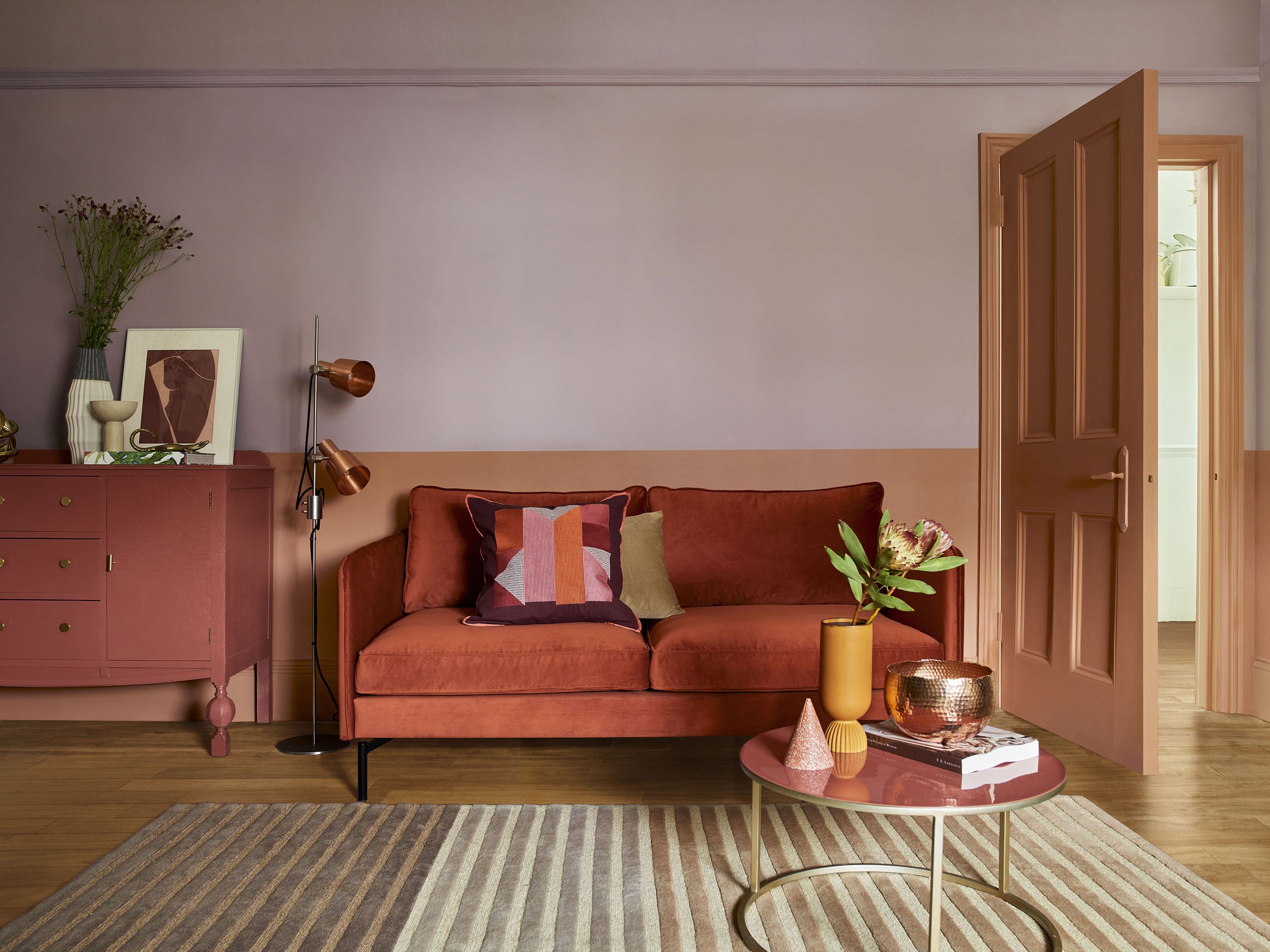
As a rule of thumb, work towards the 60/30/10 rule with no more than three main colours, and you won’t go far wrong. According to the formula – tried and trusted by interiors experts the world over – 60 per cent of the colour in your home should be the primary shade. A dominant neutral such as cream, beige, white or grey are the safest bets as they’re utterly timeless and work with most furniture, although there’s nothing to say the primary can’t be something with a bit more punch (such as Dusted Heather, pictured); 30 per cent should be a secondary colour that complements the primary (Red Sand, pictured); and 10 per cent should be an accent colour that either complements or contrasts with both with the primary and secondary (Red Ochre, pictured). Think of all three colours as a family and select shades that are the same temperature. This means that even if they’re as far apart as blue and pink, they’ll still sit comfortably together, as tonally they’re a match (warms with warms; and cools with cools, etc.).
Connect with colour
Pick a flow-through paint that connects the communal spaces in your home. When the hallways and the landing are uniformed, for example, this automatically creates cohesion, even if the other rooms are drastically different. Pale tones such as Indian White, Powder Colour or Clear Skies are still timeless but a bit warmer than traditional white or grey. It’s not just matching walls that can work wonders, either: painting all the woodwork in the same shade is a sure-fire way of unifying spaces and creating an ‘anchor’ with colour. Keeping trim simple in a darker neutral like Beachcomb Grey™ or Pewter Plate™ means it will work with most wall colours, too.
Select your sightlines
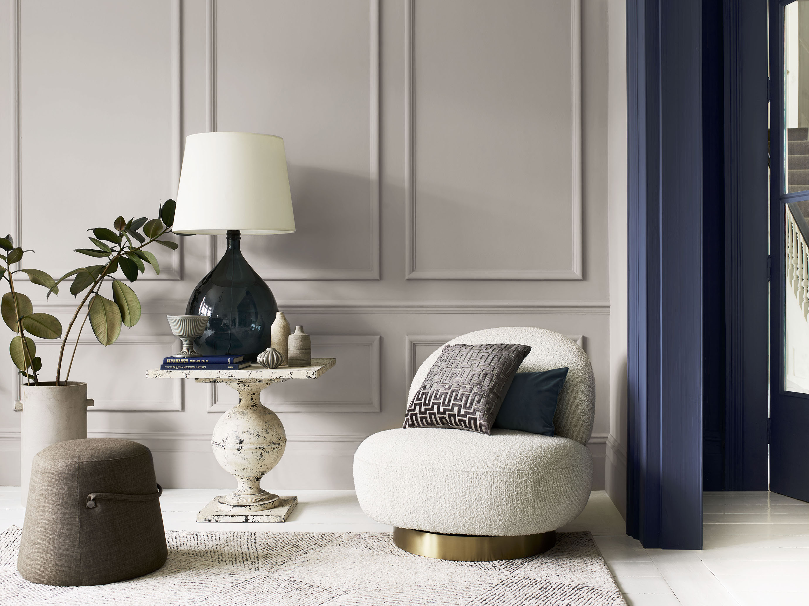
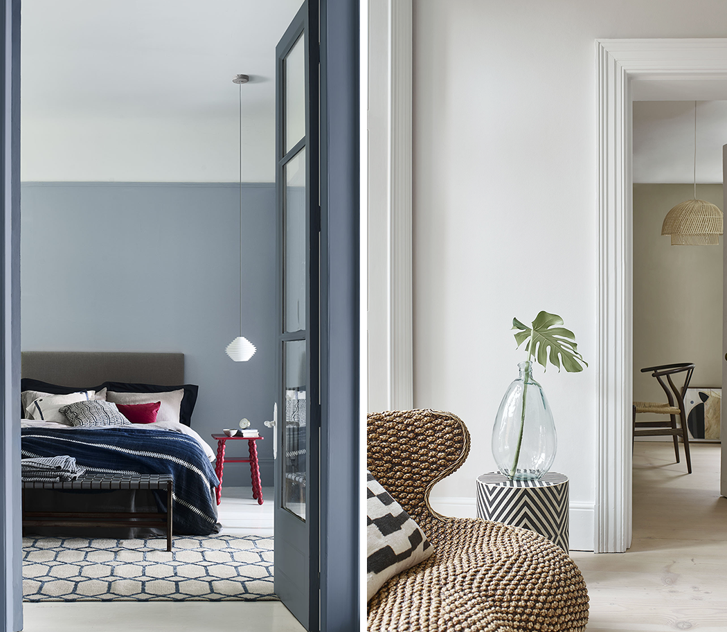
Often overlooked, but crucial for cohesion of a colour scheme, consider what other rooms can be seen from your spaces and select your palette accordingly. For example, Blue Ribbon in a bedroom complements Boathouse Blue in a hallway, with a ceiling in crisp Edelweiss White providing contrast; and likewise for Raw Cashmere in an office, and Romney Wool™ and China White in a living room (both pictured). Elsewhere, the wall of a downstairs toilet should reveal a shade that’s sympathetic to the hallway when the door is left slightly ajar. And open-plan living needs to work harder still by zoning individual areas with colour while still looking harmonious together.
Go bold behind closed doors
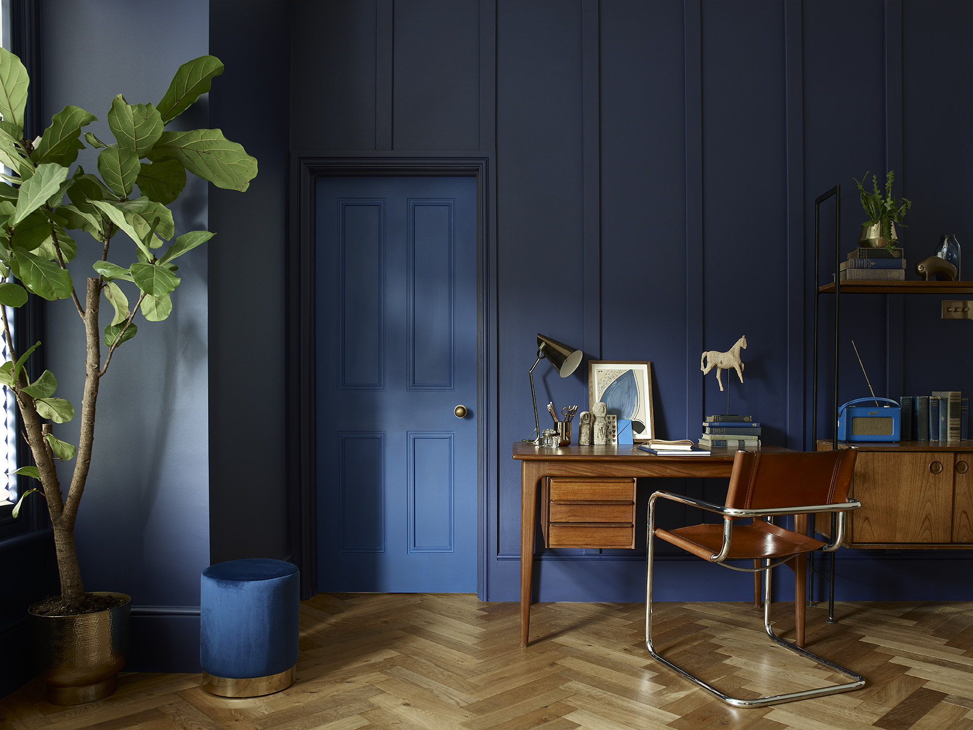
Reserve your boldest and edgiest colours for rooms that usually remained closed off to the rest of the house. Perhaps a home office painted in a combination of deep DH Oxford Blue and Deep Ultramarine? Or a dressing room that’s a dusky shade of Potters Pink? With a simple door removing the danger of a colour that jars with a coherent scheme, you can go completely wild, and create an element of surprise in the most unexpected of spaces.
Use our planning tools
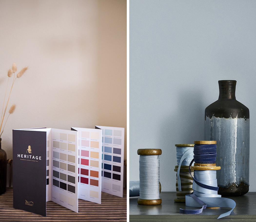
Still stuck on a scheme? Use our online Colour Wall or free printed Colour Card to browse curated palettes and find complementary paints. Discover shades quickly and easily by exploring tonal matches (pale, mid, deep, white) or colour groups (cool neutral, warm neutral, orange, green, blue, etc.). Use light and dark shades of the same colour for guaranteed cohesion with no clashing or competing hues. Or plump for a blended palette with colours that flow beautifully from one to the other, found as neighbouring swatches. Better still, every colour in the card is sorted into a column, with each column paired to the perfect white for ease. With everything carefully arranged by our experts, you can let your imagination run wild, safe in the knowledge that shades will work harmoniously.
Commit to colour
Not only does Dulux Heritage look beautiful, but it feels gorgeous under your fingertips, with a velvety matt finish for walls and an eggshell with a soft sheen for woodwork. Try it today by ordering a tester or commit to colour by choosing a can.
Share your coherent and stylish colour schemes with us on social using #MyHeritageHome and tagging @DuluxHeritage – you could feature on our Instagram and Facebook pages.