Inspiration Article
Masterclass: Paint by feeling using our hero palette of 2023
Every year, the experts at Dulux Heritage dip into the world of decorating to cherry-pick the colours that will define the following 365 days, encapsulating the cultural zeitgeist and our national mood. But these aren’t colours that have been created just for 2023 or on a whim: they come together to form a timeless palette that already exists as part of the 112 paints within the Heritage Collection. We simply highlight these hues to demonstrate their relevancy in terms of how we want to decorate our homes right now. From an earthy red and a luxurious green to a burnished gold and a relaxed blue, there’s something to suit every taste, while transforming not just our spaces but how we feel in them. Love, peace, calm, zen – peruse and choose from a palette that helps you paint by feeling.
A masterclass in memories
Marianne Shillingford, our creative director, explains how the hero colours in our 2023 palette were expertly cherry-picked. “Our homes and everything in them should evoke a sense of our true identity and how we feel,” she explains. “Choosing colour with feeling is something we instinctively do but rarely acknowledge, and with the hero colours in our 2023 palette, we wanted to capture the way colour can transform a room on an emotional level as much as it can on an aesthetic one. For example, south Devon is my favourite place on earth because I spent my summer holidays as a child there camping with my family in a field overlooking the beautiful Salcombe Estuary. Country Sky is a shade that instantly transports me to a beach filled with unexplored rock pools and when I see this shade, I get an overwhelming feeling of being a little girl again. It says: ‘Everything is going to be OK.’ Colour pushes memory and sensory buttons that transport us to times and places we never want to forget. Paint them on your walls to create a look that provokes much more than just admiring glances.”
A spectrum of feelings
Indeed, in 2023, our homes are so much more than beautiful spaces to show off to friends and family, or somewhere to simply lay our heads at the end of a long day. They need to work harder than ever to accommodate our shifting physical and emotional needs: a sanctuary that soothes the stresses and strains of everyday life; a hive of activity, from work to play, that energises and motivates; and a home that bolsters our health and wellbeing. Sometimes, a single space needs to accommodate all of this – and so much more – from a simple lick of paint. “As much as we use our homes for multiple functions, from sleeping to entertaining and working, we need each space to help us get into the right frame of mind for the activities they’re designed for,” explains Marianne. “In a bedroom we need quality sleep to wake up feeling refreshed; in our kitchens and dining rooms we need to connect with loved ones at mealtimes; and in the living room we need to relax and unwind.” Drawing on the psychology of colour, Marianne and her team have curated a flexible palette that puts their properties through their paces, all rooted in nature to evoke the times, places and stories that are precious to us. Expectations have never been higher and the hero colours within the Heritage collection exceed them, and then some.
Tasting notes
Here, Marianne rounds-up the colours that have been curated as part of the 2023 palette, exploring the inspiration behind them and the feelings they evoke.
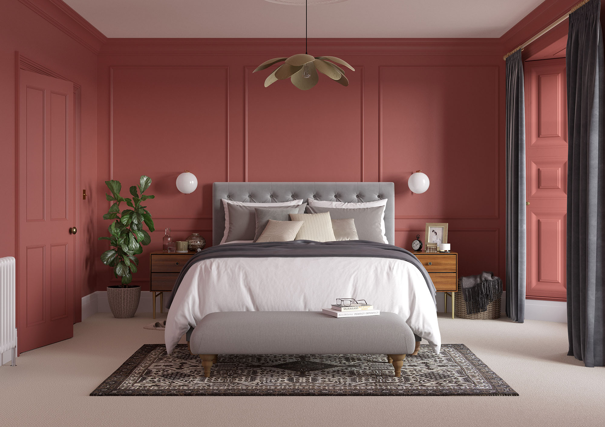
Red Ochre
“Red Ochre is the colour of the most popular natural clay earth pigments mined in the UK. This chestnut red is a colour we’ve been painting onto the walls of our homes since we first discovered fire. It’s the perfect shade to try a colour-drenching technique in a living room, bedroom or dining room, while being more subtle than full-on red create a spicy, warm atmosphere that’s both elegant and comforting.”
Mallard Green
“Mallard Green is the colour of wild drake feathers in spring. Gloriously rich, it’s bursting with swagger and effortless appeal, both to female ducks and humans alike. The plumage-inspired green works gorgeously in main bedrooms and dining rooms, as well as snug little spaces, where it makes everything look you won a large amount of money at the races!”
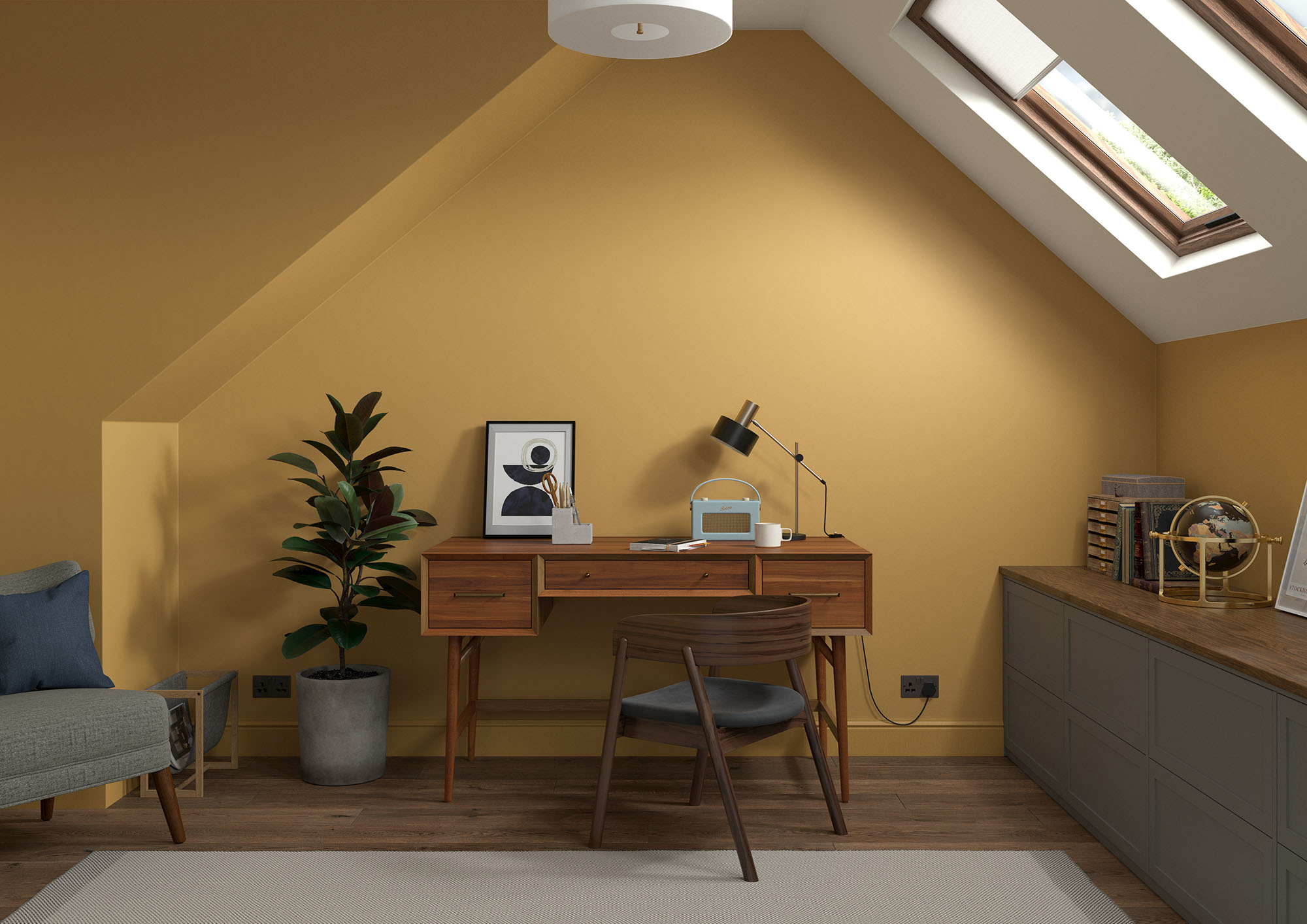
Brushed Gold
“Brushed Gold was the colour of choice for spaces in which we relax and entertain, beloved because it made even the humblest of furnishings look more precious. Rich and opulent, it’s got a gently simmering energy that makes it perfect for adult bedrooms, dining rooms and home offices. It positively glows with candlelight warmth in the evening when the fire is on and the lights are low.”
Pale Walnut
“Pale Walnut is a fresh plaster pink with a hint of grey that gives it a modern edge. Timeless and versatile, this Georgian favourite has earned its keep as every designer’s ‘go-to’ for rooms that need a gentle blush rather than a more obvious pink. It’s a luxurious neutral that pairs with stronger colours seamlessly like a faithful life-long friend. The perfect shade for anywhere you may have used grey in the past – which is pretty much any room in the house.”
Country Sky
“Country Sky is a classic coastal blue. Softened with a hint of grey – like all British summers – this delicate shade changes as the sun moves across the sky and has been part of British decorating heritage for over 200 years for good reason. It’s perfect in rooms where you want to feel tranquil and at peace with yourself and the world. Try it in bedrooms, studies and living rooms where the light is warm and plentiful.”
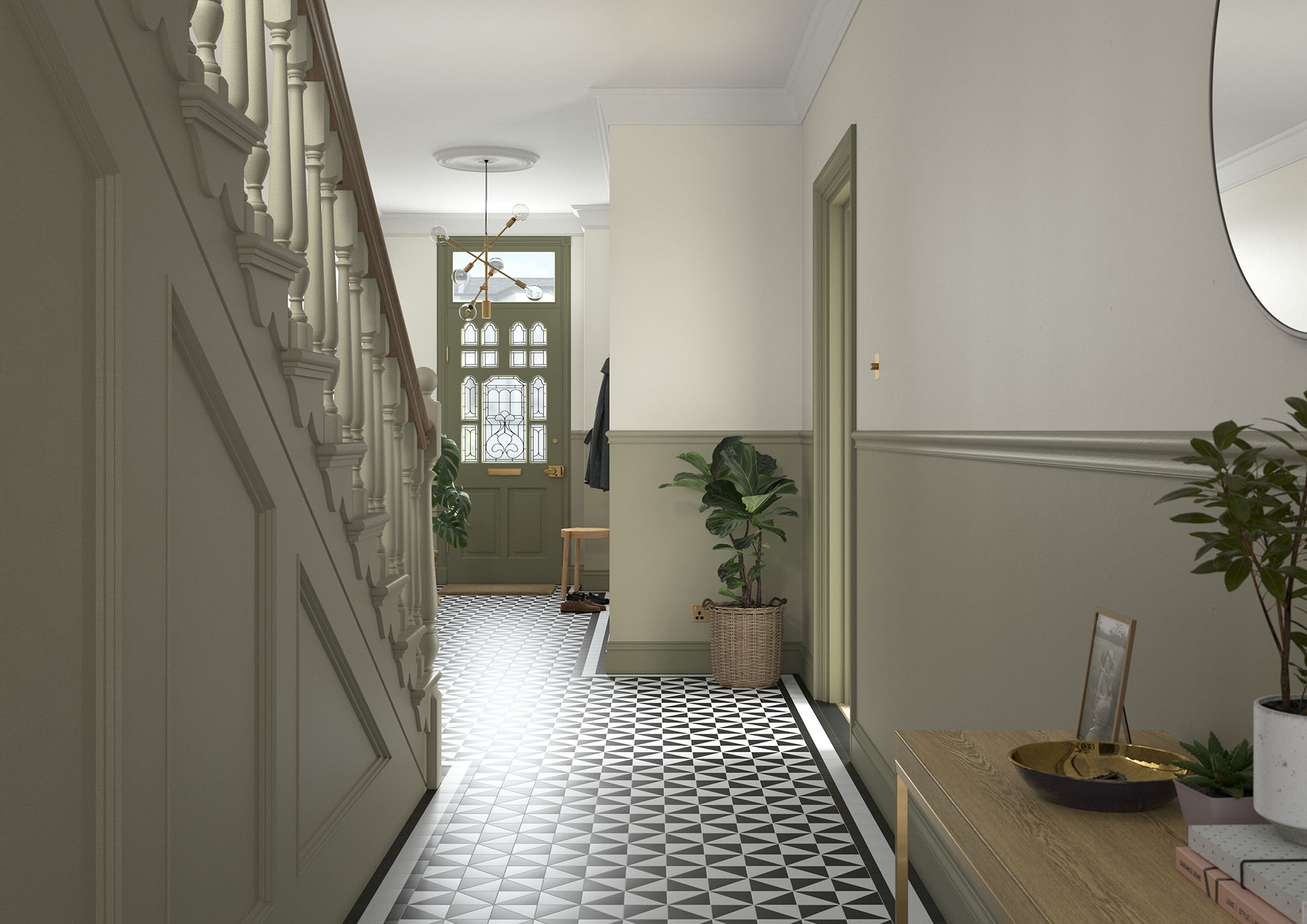
Olive Tree
“Olive Tree evokes a sense of the warm Mediterranean landscape in the cool conditions of our northern hemisphere and is one of the most versatile greens you can use in any style of home. Better still, it looks as incredible with Mid-Century modern furniture as it does with the scrubbed country pine of its origins, and works particularly well in places where we gather to enjoy each other’s company. Soft and warming, with hints of gold, try it in a kitchen or living room to bring the outside in.”
Last word
“Colour is an unspoken visual language we use to express and enhance the way we feel,” concludes Marianne. “We make choices about it every day when we decide what to wear and what to eat. We code our lives and communicate with each other through this magical medium that’s often dismissed, especially in our homes, as simply decoration. Although there are some generalisations we can make about families of colour and how they might make us feel, it’s the subtle shades of a particular hue that has the power to take each of us to places in our minds bursting with memories and joy. Decorate with the way a colour makes you feel in mind and it will be the most successful decorating you’ll ever do.”
Three ways to try the palette for yourself
1 Powerful enough to stand alone, paint Red Ochre, Mallard Green and Brushed Gold as a single colour in your room of choice, or pair with Quartz Grey to create a subtle contrast in tone and add a touch of lightness to a space.
2 Give your woodwork some wow by contrasting Country Sky on the walls with Swedish white on the skirting and ceiling.
3 Create a horizontal band of colour around the bottom third of a room in Waxed Khaki offset by Olive Tree on the top third. The effect will mirror the natural landscape and make you feel grounded.
Commit to colour
Not only does Dulux Heritage look beautiful, but it feels gorgeous under your fingertips, with a velvety matt finish for walls and an eggshell with a soft sheen for woodwork. Formulated with premium quality pigments, Dulux Heritage Velvet Matt guarantees excellent depth of colour for your walls, while specially-blended clay ensure effortless application; mixed for use on wood and metal, Dulux Heritage Eggshell provides a stunningly smooth finish, while being reassuringly hard-wearing. Both are water-based for a more sustainable paint. Why not try Dulux Heritage today by ordering a tester or commit to colour by choosing a can?
Dulux Promise
Better still, Dulux Heritage falls under the Dulux Promise, or commitment to giving you the perfect colour with a uniform finish and the coverage stated – or we’ll replace it. No risk, just results.
Share how you use our hero colours on social using #MyHeritageHome and tagging @DuluxHeritage – you could feature on our Instagram and Facebook pages.