Inspiration Article
Why white is never 'just white': the Dulux Heritage whites that transform a room

White is chosen more often than almost any other wall colour, usually because it feels like the safe option. In practice, it's a colour that’s more complex than you might imagine. We asked interior textiles and soft furnishings expert Eva Sonaike to talk us through how she uses our timeless whites to totally change the warmth and feel of a room.
There's no such thing as a neutral choice
Every white carries an undertone, and that undertone does a lot of the work in how a room ends up feeling. A cooler white can sharpen a space and make it feel crisp and modern. A warmer one can wrap a north-facing room in cosiness. Neither is right or wrong; it depends on the room you're working with and how you want it to feel.
This is why Eva rarely settles on a single white for a whole room. Ceilings, woodwork and walls each get their own shade, close enough in family to feel cohesive, but different enough that you notice the change from one surface to the next. It's a technique borrowed from how a well-edited wardrobe mixes cream, ivory and oatmeal rather than repeating one flat colour throughout, and it's what stops a white scheme from feeling cold and clinical.
Our own range reflects that same thinking. Each shade in the collection has its own personality. For example:
- Chiltern White is soft and understated
- Chalk White is crisp and fresh
- Linen White is gently creamy
- Roman White is refined and elegant
Pair two or three from across the palette, and you get depth that a single shade can't deliver on its own. You can browse the rest of the Dulux Heritage collection on our colours page.
Why the same white looks different in every room
A white that looks perfect on the paint chart can behave differently once it's on your wall, and the culprit is almost always light. Morning and evening light pull out different undertones. North-facing rooms tend to mute warmth, while south-facing ones amplify it. Add artificial lighting into the mix and a shade that felt soft and creamy in your living room can turn noticeably cooler in the hallway.
That's why we'd always encourage testing over trusting the chart alone. Our lighting tool, built into our colour pages, shows how your chosen Dulux Heritage colour shifts across the day and under different light sources, so you can rule colours in or out before you've opened a tin.
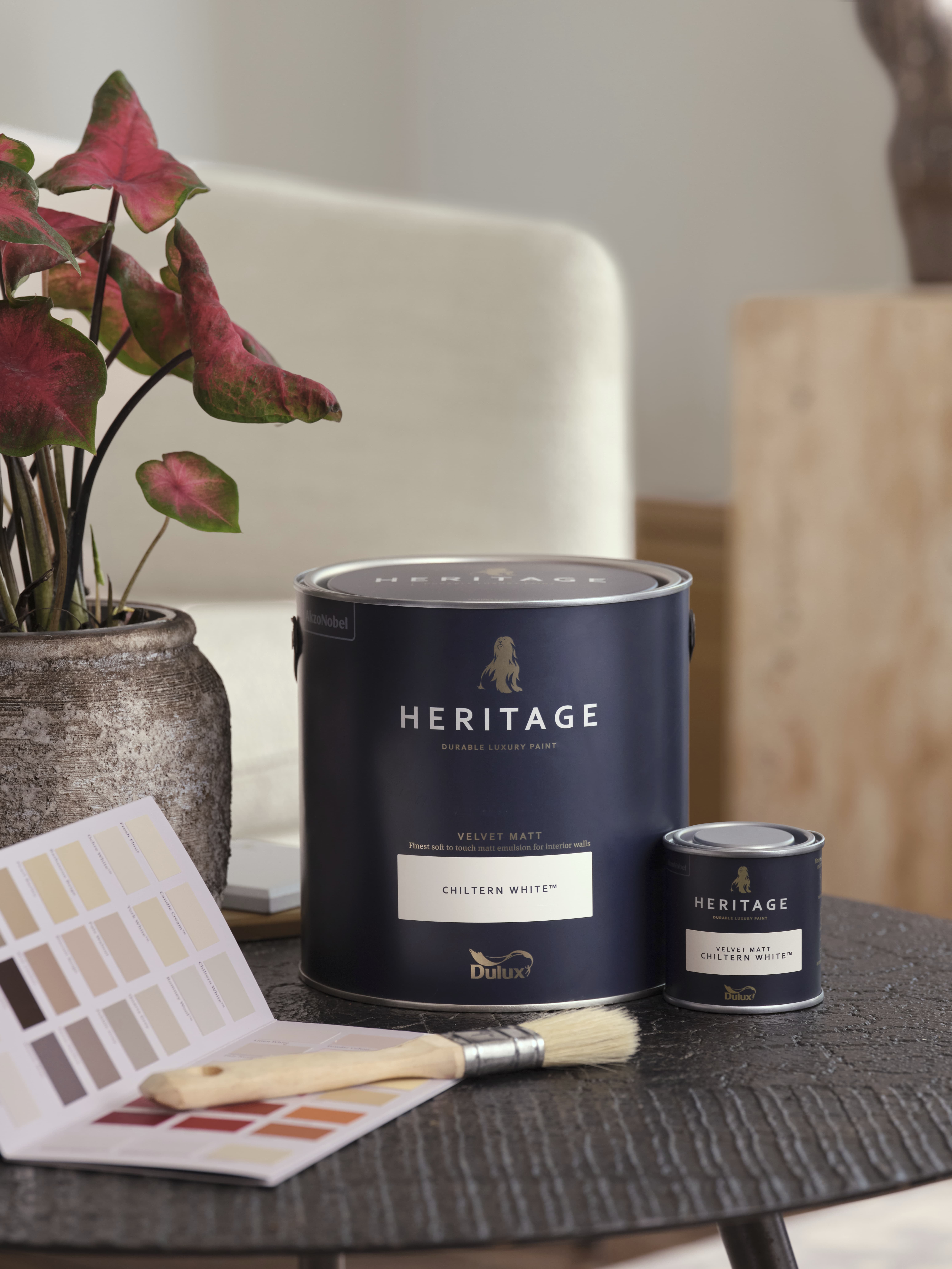
The finish matters as much as the shade
Shade aside, the finish is something else you can play with. Instead of applying one sheen across every surface, Eva varies it: a soft Velvet Matt on the walls to absorb light and keep the room feeling grounded, then Eggshell on woodwork, cabinetry and architectural detail to add a subtle lift.
The contrast is understated rather than showy, but it's what gives a white room the sense of richness that a single flat finish can't match. Our full range of finishes is on the products page.
How to choose your perfect Dulux Heritage white
Faced with dozens of whites, it's tempting to hunt for the one universally 'right' shade. A better starting point is deciding how you want the room to feel: foft and cocooning, fresh and airy, or calm and cool.
From there, factor in the room's natural light and the materials you'll be decorating around. Our curated palette of timeless whites is designed to make that shortlist manageable, and the lighting tool lets you test your top picks before committing. The best white for your home is the one that suits the room and the way you live in it. For more on this, our decorating ideas and practical help sections go into greater depth.
Dulux Heritage whites for different room types
The right white also depends on what the room is used for and which way it faces. As a starting point:
- Living rooms: Chiltern White works well if the room gets a lot of daylight, since its warmth stops a bright space from feeling stark.
- Bedrooms: Linen White suits rooms where you want a calmer, softer feel, particularly if the room faces north.
- Kitchens: Chalk White holds up well against strong artificial lighting and reflective surfaces like tiles and worktops, keeping the room feeling fresh rather than clinical.
- Hallways and landings: Roman White is a good choice for spaces with limited natural light, since its warmer undertone stops the space from feeling cold.
- Bathrooms: a cooler shade such as Chalk White pairs well with tiling and chrome fittings, while Linen White softens things if the room has a lot of wood or warm-toned stone.
Inside Eva's finished scheme
Paint is only the starting point. In the video above, you can watch Eva's project move from mood board to finished scheme: sculptural ceramics, warm timber and richly patterned textiles all sit on top of the paintwork, and the room reads as considered, not overly styled.
She built the whole scheme around Chiltern White, then layered colour on top of it. Muted Country Sky adds definition, while Masters Gold and Red Ochre bring in the same warmth found in her textiles and handmade accessories.

Chiltern White's balanced warmth means it lets those bolder accents stand out without fighting them for attention, while small tonal shifts between walls and woodwork keep the whole thing from feeling one-note. The result shows what a good white scheme actually does: it gives everything else in the room somewhere to shine.
If you're ready to find your own, our online tools take the guesswork out of the process, from watching a shade change through the day to locating your nearest stockist. You can also order a Dulux Heritage colour card or tester pot before committing to a final shade.