Inspiration Article
Colour Confidential: Be inspired by the ice-cream shade trend
Strawberry pinks. Mint greens. Lavender purples. We’ve got the inside scoop on the coolest trend for summer: ‘ice-cream’ shades. Inspired by the colours and flavours of our childhood, sugary-sweet pastels have been given a grown-up edge, and are lighter and brighter than previous iterations. The new-wave of smart pastels is both refreshing and celebratory – perfect for creating whimsical spaces as we step into a positive future. Think ultra-cool WFH studios for igniting ideas. Fashionable kitchens for fanning creative flames. And chic walk-in wardrobes for style statements. Here, we round-up the colours and spaces to help you get the trend well and truly licked – are you ready to put on your sundae best?
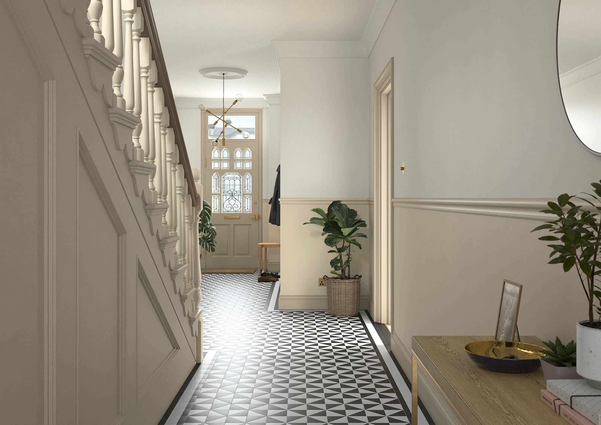
Clotted cream
Like a buttery biscuit or caramelised butterscotch, deliciously pale Cream in the Heritage Collection has a distinctive foodie quality, and can be used to create a warm and welcoming entrance. Here, we’ve used the light but substantial colour on the staircase and lower-half of the wall in a hallway, complemented by peachy Candle Cream on the upper-half. Elsewhere, weightier Mid Umber on the skirting and front door ground the surrounding pastels, while charming Mallow White on the ceiling ties everything together.
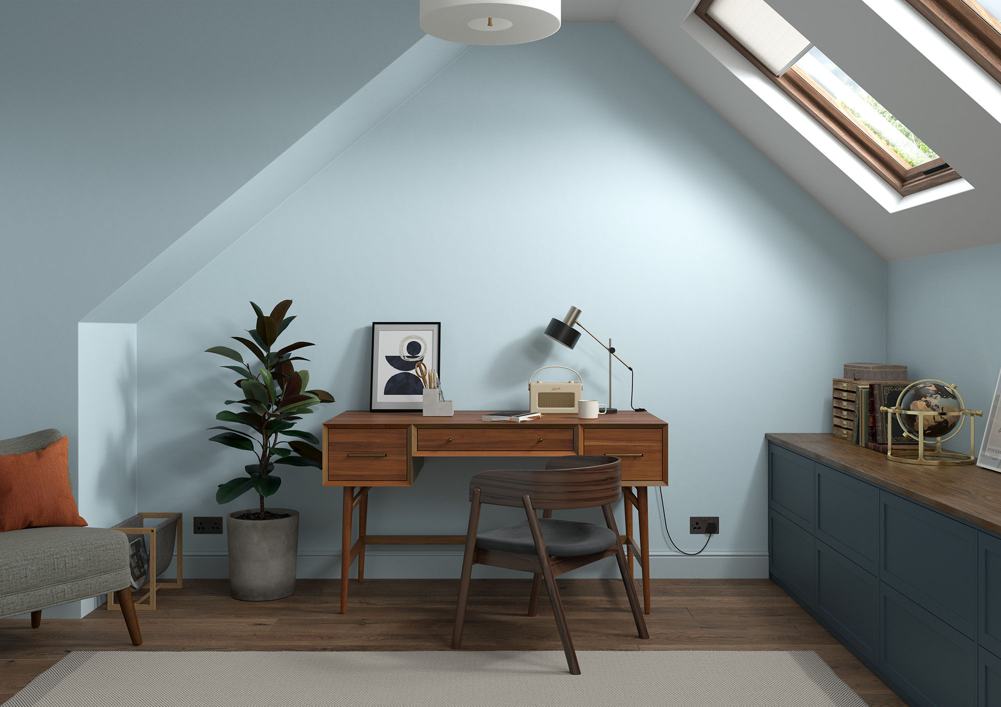
Fresh blueberries
Blue may be the colour least associated with food, but who can resist the sweet taste of blueberries in the summer, especially when dusted with icing sugar to draw out the flavours? The colour of the clearest sky, Copenhagen Blue works wonders to sweeten dark spaces such as this loft conversion, teamed with muted Country Sky™ on the woodwork, crisp Swedish White™ on the ceiling and deep Midnight Teal on the cabinet. All winning ingredients.
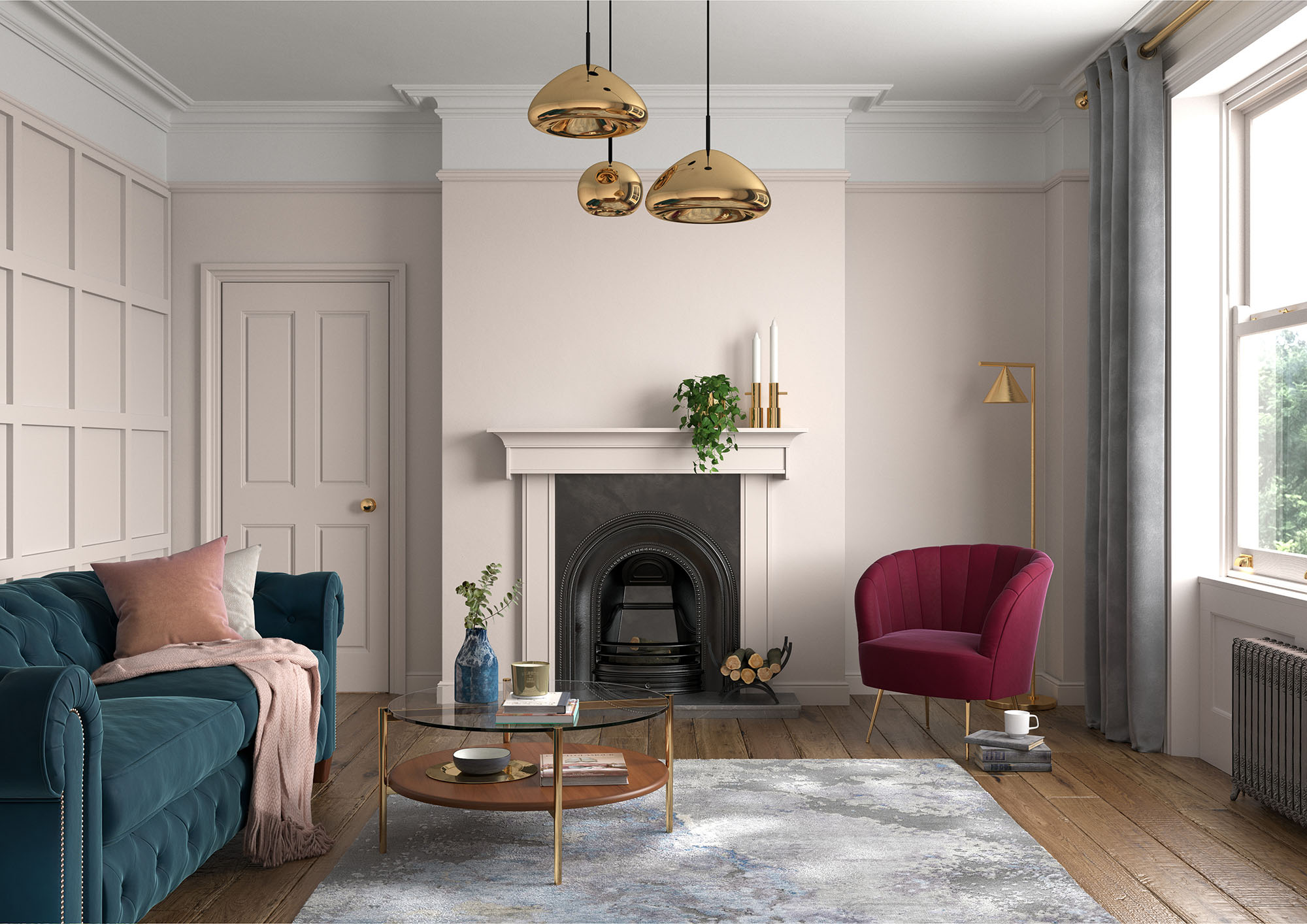
Rosé season
Bring all the feminine beauty of everyone’s favourite summer tipple into the living room with Provence-inspired Powder Colour. The pale blush pink is a gentle and relaxing shade that can easily be given an edge with punchier colours in furniture and furnishings. Here, we’ve completely drenched the expansive walls of a dramatic period home, using the colour to pick up details in the traditional panelling and fireplace. Everything else from the picture-rail upwards is painted in delicate Wishbone White, making the ceiling look higher than it is, while jewel-toned and metallic accessories add luxury.
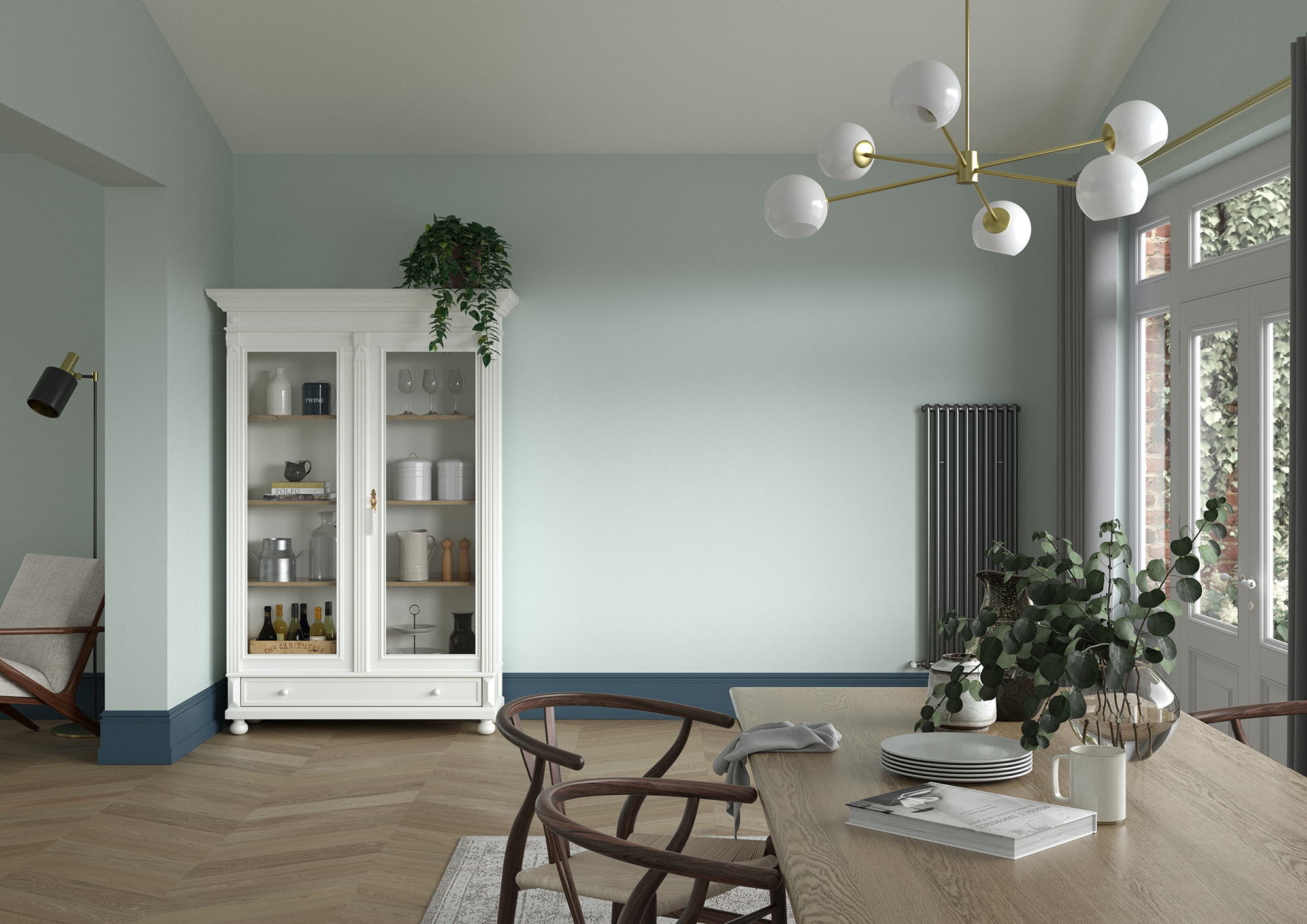
Herb garden
Evoking the shade of everyone’s favourite summer ice-cream – mint chocolate chip, what else? – this kitchen-diner is invigorating and refreshing. The colour? Green Oxide, a pale, blue-based green, also associated with 17th-century Chinese Celadon. Breathing life into the space, the hue brings the herb garden outside firmly in, complemented by intoxicating Midnight Teal on the skirting. Crisp Panel White on the ceiling and sunny China White on the dresser complete the look.
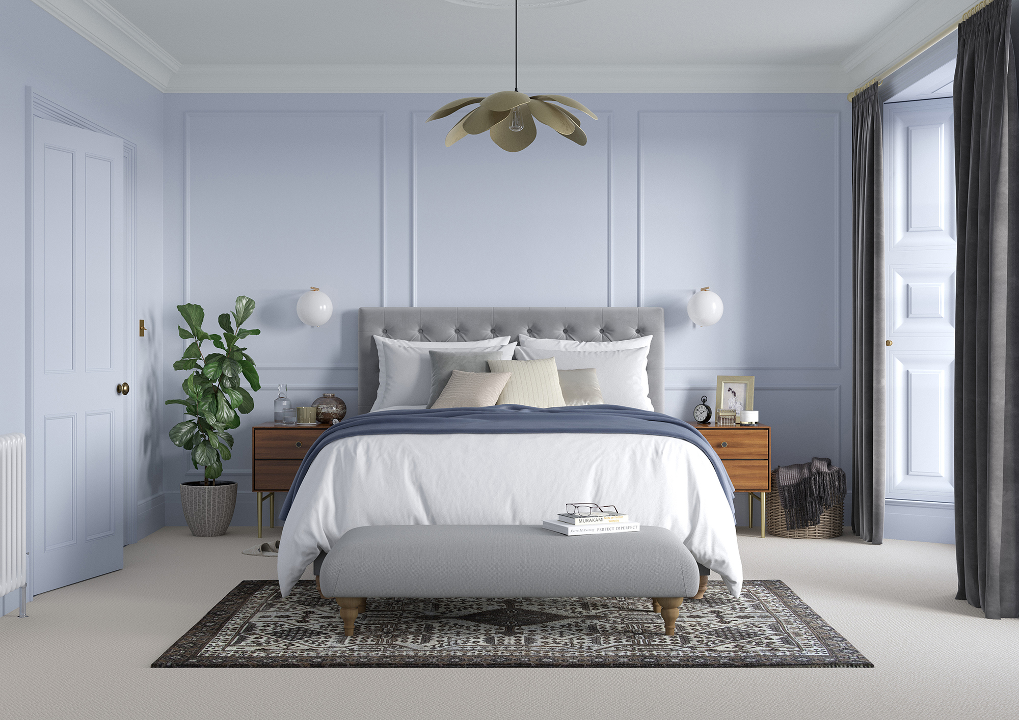
Lavender fields
Waft through the lavender fields of France without ever leaving home. Blue-based purple Lavender Grey isn’t only trending, but it’s utterly timeless, too, with a refinement and mystery that beguiles in a bedroom. Wrapped on the walls and woodwork here, it’s truly immersive, while Panel White on the cornice and ceiling adds further freshness. You can almost smell the flowers, can’t you?
Three more ways to try the ice-cream shade trend with Marianne Shillingford, creative director at Dulux UK
- Ice-cream in a sweet waffle cone is a match made in taste heaven. Colour-wise, it’s the same when it comes to combining ice-cream shades in your home. Caramel biscuit hues in wooden flooring and soft furnishings really complement these grown-up pastels, and if you make the colour ratio the same as a cone – one-third ice-cream shade and two-thirds warm neutrals or vanilla – the effect is simply delicious.
- Layer the colour ‘flavours’ and split the room in two. Use the palest shade on the ceiling and top-third of the walls, then team with a slightly deeper colour to the floor, including the skirting boards.
- For a more fun use of ice-cream shades, you need to dial up your inner child and add ‘sprinkles’. Paint the walls in your favourite ice-cream ‘flavour’ and add brighter colours in painted features like spots and stripes, picture frames and furniture.
Commit to colour
Not only does Dulux Heritage look beautiful, but it feels gorgeous under your fingertips, with a velvety matt finish for walls and an eggshell with a soft sheen for woodwork. Try it today by ordering a tester or commit to colour by choosing a can.
Share your ice-cream shades on social using #MyHeritageHome and tagging @DuluxHeritage – you could feature on our Instagram and Facebook pages.