Inspiration Article
Rethinking white walls: how to make your tonal scheme feel rich and considered

White walls are often overlooked in favour of trending colours. Too often, they’re written off as safe, plain or lacking personality. But actually, white is a more sophisticated colour than you might think. White isn't a uniform shade – it's a spectrum of near-endless nuances, and each one brings something a little different to how a room feels.
Take our colour chart as an example. Move from the light, elegant Linen White to a warmer neutral like Chiltern White, and you'll find some shades bring warmth and cosiness, while others feel cool, crisp and contemporary. Undertones matter too: they can take white, and your walls, in very different directions. Far from feeling one-dimensional, the right white can bring remarkable depth and softness to a space.
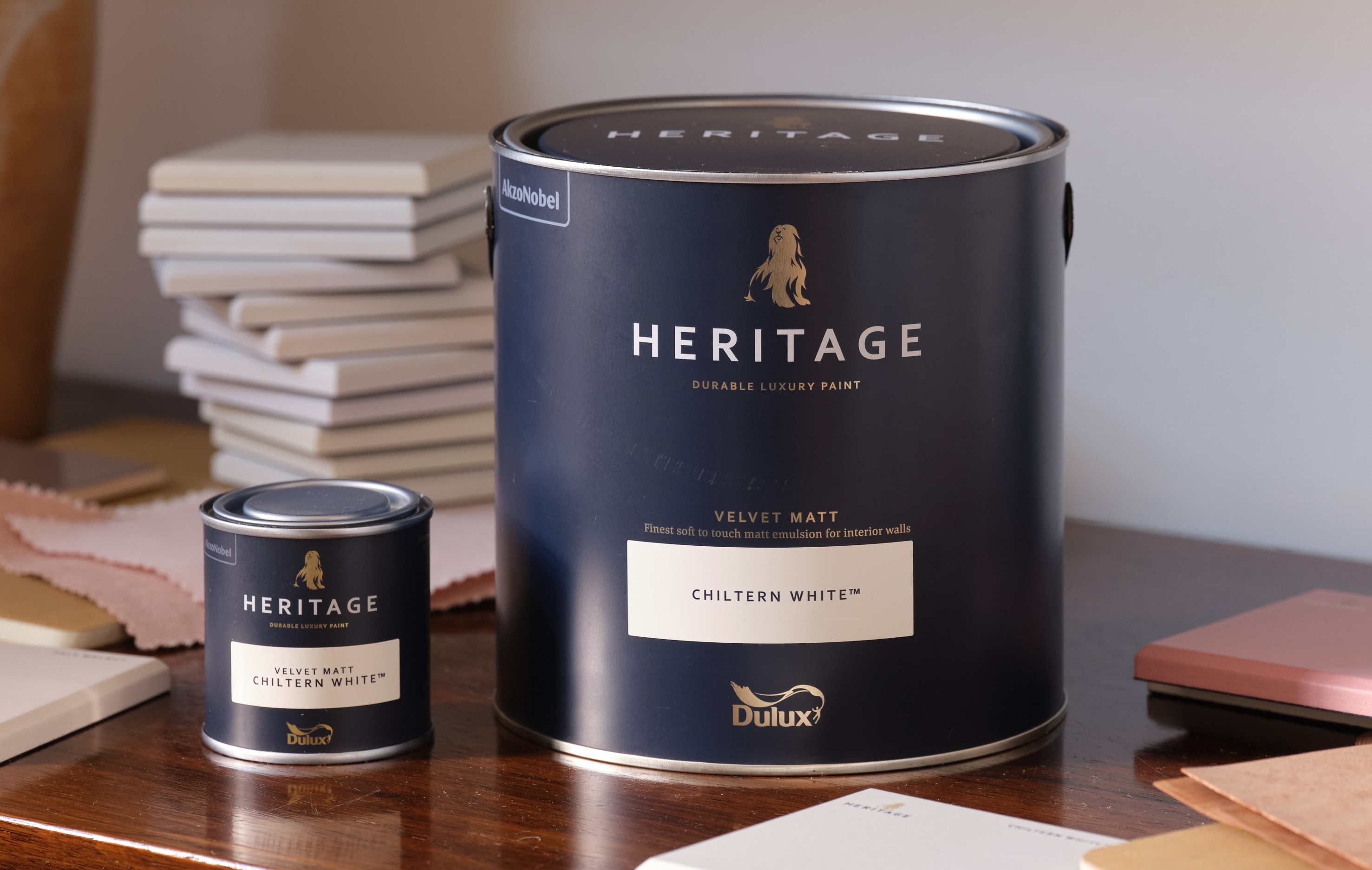
It's not just about which white you choose, but how you build a colour story around it. White can hold its own, but in different combinations, from soft tonal looks to bold contrast, it still brings plenty of interest and excitement to a room.
So, what can you actually do with white? We asked Dulux Heritage's Creative Director, Marianne Shillingford, to share her favourite ways to use our most evocative white paint colours, and how each one can lend a a tonal scheme a real sense of sophistication.
Start with a soft, tonal scheme
Your colour card is the best place to start. Take Chiltern White: it sits within a family of lighter and darker tones, which is exactly what makes it useful for building a tonal scheme.
"It's surrounded by lighter and darker tones of colours from the same family," Marianne explains, "which create this seamless, elegant, sophisticated look."
Working within that same colour family, rather than reaching for shades that fight each other, is what gives a tonal scheme its calm, pulled-together feel.
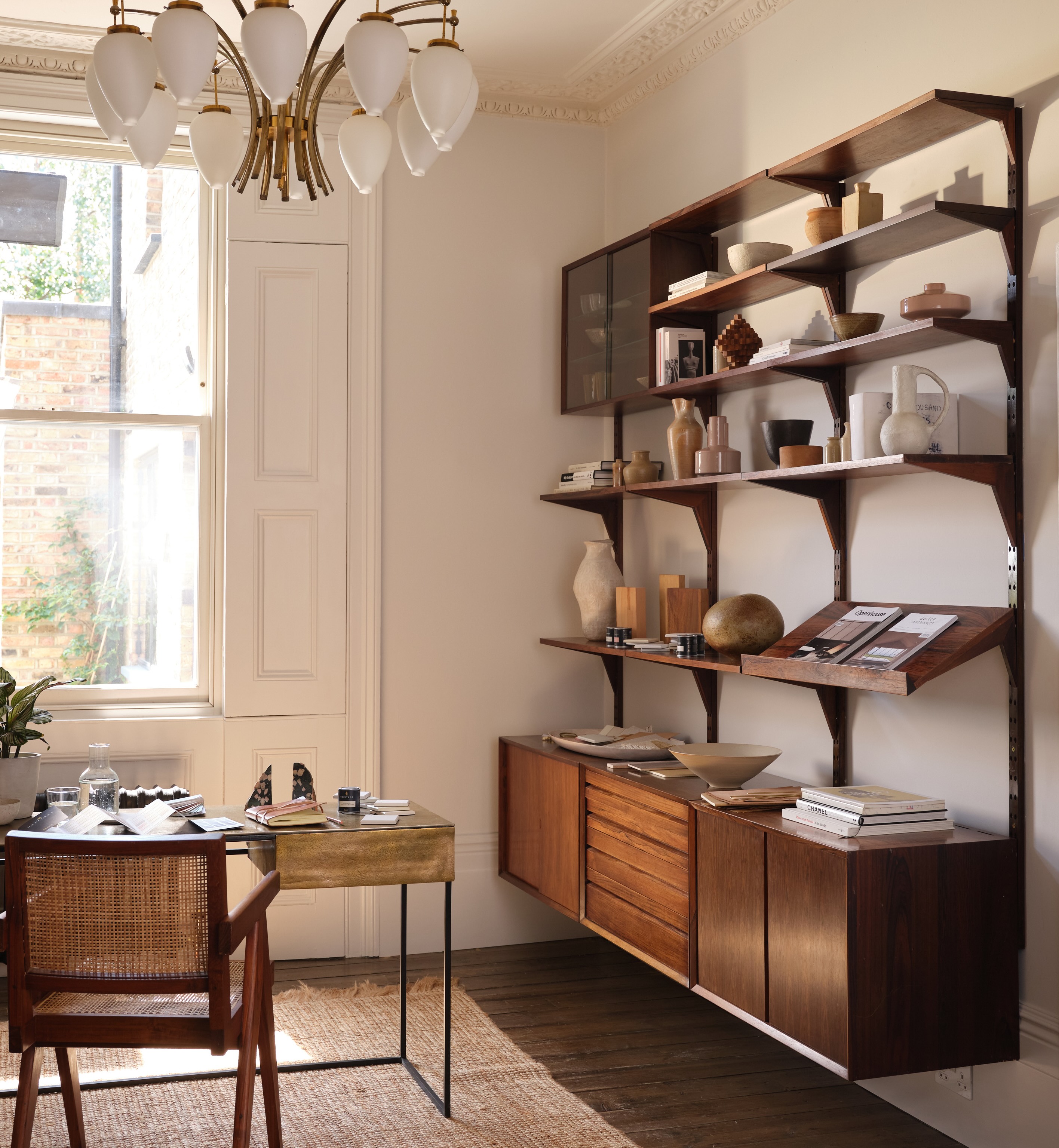
Pictured: a room colour drenched in Chiltern White, a warm, off-white with plenty of character.
Commit to the colour
Colour drenching isn't only for bold shades. Using white across the walls, skirting, cornicing, architrave and windows makes for a strong, confident look rather than a tentative one.
"Commitment is what makes a great relationship," Marianne says, and the same is true of a room. Painting every surface in the same white removes the visual clutter of contrasting trims, letting the architecture of the room, and the shade itself, take centre stage.
Let contrast do the work
Once your base is applied, think about what sits alongside it. "There's a great phrase in design that says colour gets the credit, but contrast does the work," Marianne Shillingford, Creative Director explains.
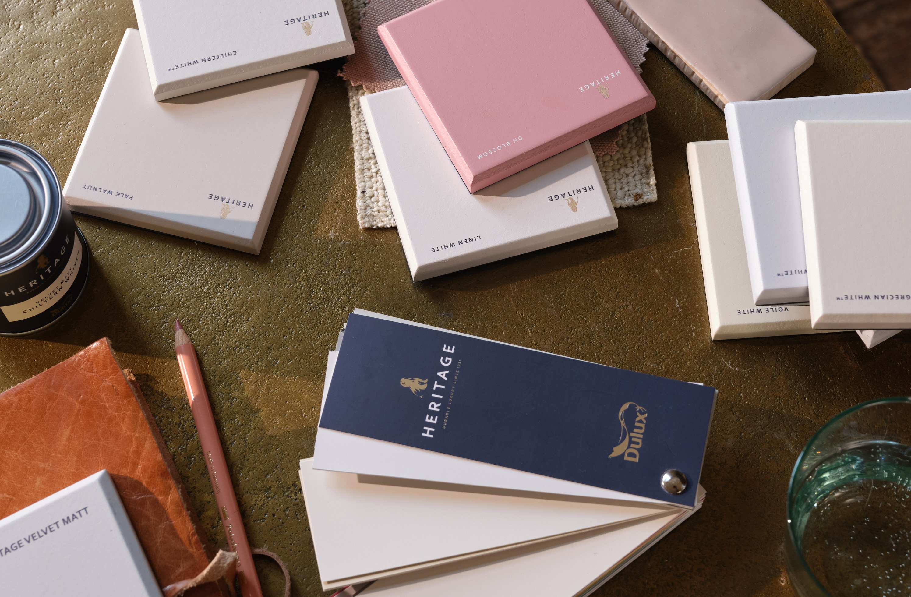
Pairing a wall colour like Chiltern White with bolder, darker tones, whether that's on woodwork, furniture or soft furnishings, makes those darker tones jump forward and gives the whole scheme more impact.
Explore more ways with white
If this has got you thinking about your own walls, a few of our other guides are worth a look:
- Discover our go-to whites: our favourite white shades and what makes each one distinct
- Nailing the ultimate neutral: how to use white as a blank canvas for colour and quirk elsewhere
- 4 ways white can transform your home: from cool, crisp whites to soft butter creams and warm, cosy hues
- Introducing True White: a clean, luxurious white and the perfect blank canvas for any project
For more inspiration and to explore our full range of paint colours, visit the Dulux Heritage website, or order your free colour card to see the shades in your own home before you commit.