Inspiration Article
Masterclass: How to master neutrals in different lights
From white to beige and grey, one of the nicest things about neutrals is that they’re the easiest colours to decorate with, whether used as soft backdrops by themselves, or combined with similar tones or bolder shades for a layered look. But their effortlessness can be undermined if you don’t understand the impact light can have on their subtleties. So, just like you would when choosing other colours in the Heritage Collection, consider the way sunlight enters your space (and the direction a room faces) before nailing down the perfect neutral. Here, we let you in on the science, so you can focus on the art…
Tune into tone
A curation of 112 timeless shades, the Heritage Collection has been designed for you to create gorgeous schemes easily, beginning with our free printed Colour Card. Thanks to this convenient and complimentary tool, all colours are arranged intuitively in columns of complementary shades, with hues categorised by tones. Ranging from cool to warm, it’s tone that’s crucial in choosing the right neutral, especially when considering the effect of light. What’s more, all colours have undertones, too, whether a hint of green or a dash of red – and these also impact on how they look in different lights. To help you understand a true hue, search for your preferred shade on our website (top-right of the homepage), and read its full profile.
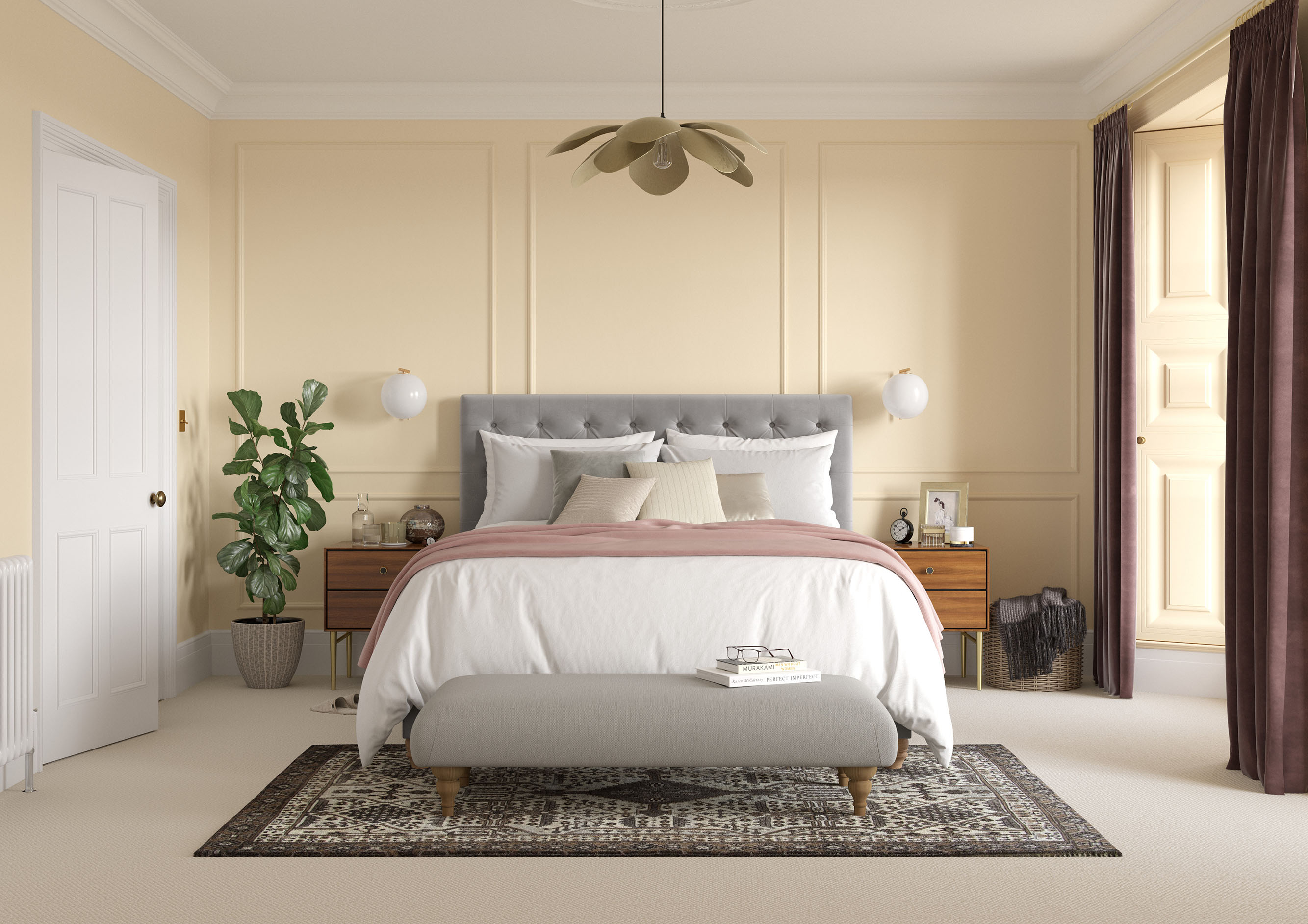
Warm up north-facing rooms
North-facing rooms bring out the cooler tones in our colours, so plump for bright and sunny neutrals with a yellow tinge over light and pale. The latter will look overly cool and washed-out in a room that receives such little light, while the likes of uplifting DH Linen Colour and zesty DH White™ will warm things up with a simple coat. Here, we’ve used light but substantial Cream on all four walls of a period bedroom, paired with woodwork in pristine Marble White and the cornice and ceiling in milky Alabaster White. With none of the neutrals appearing too stark, the affect is cocooning and comforting, without being dark and dramatic. Add to the toasty tones with accessories in warm wood and gleaming metallics, plus curtains in rich browns and a carpet in a biscuity beige.
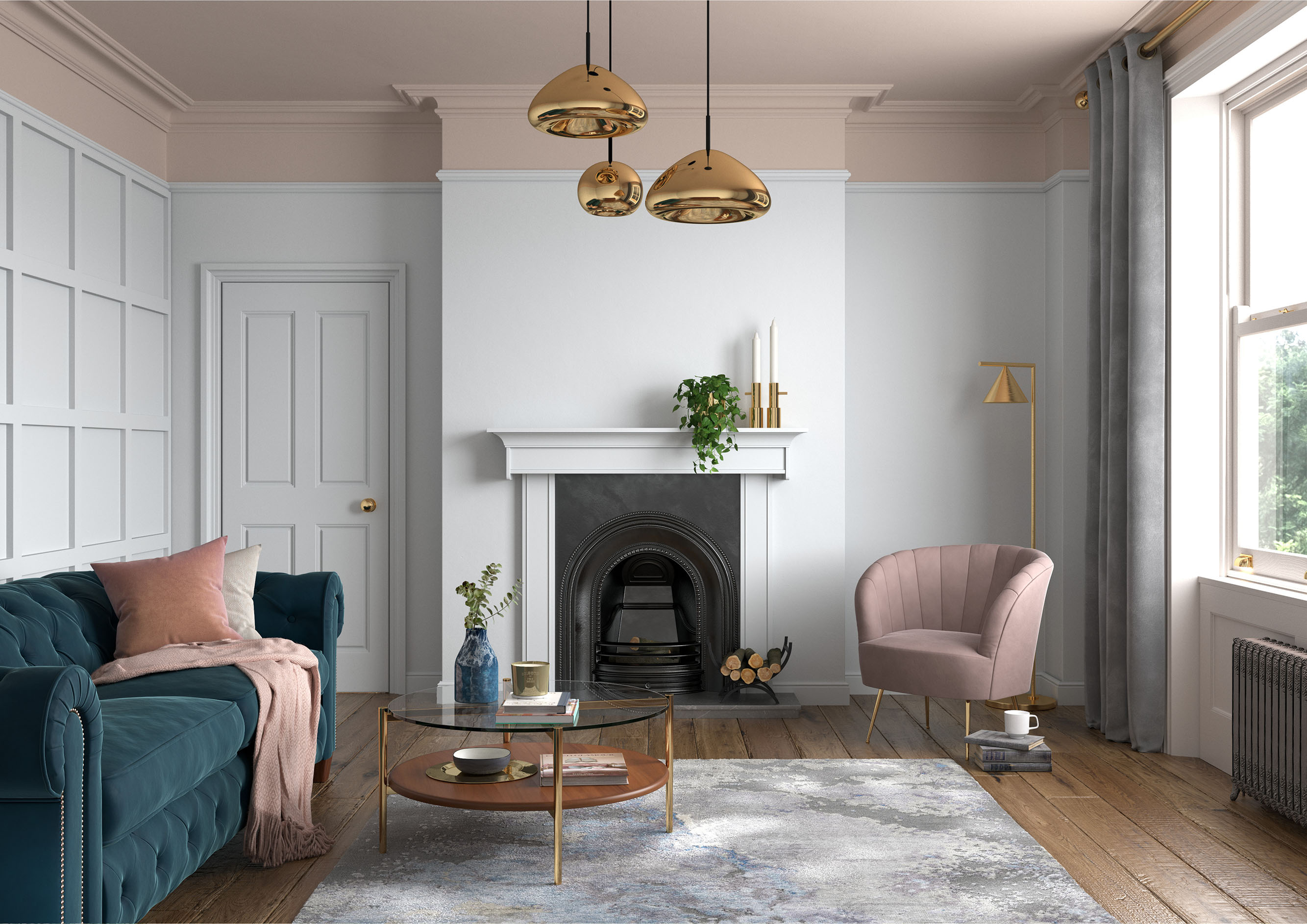
See the light in south-facing spaces
South-facing spaces, meanwhile, require soft and pale tones to embrace the natural light that floods in throughout the day. As the easiest light to work with – as it’s consistent and strong – have the confidence to choose pure white or a classic grey for a fresh and crisp look, such as sleek Marble White or silvery Turtledove Grey. In this living room, we’ve contrasted cool Chalk White on the woodwork and walls with earthy Biscuit Beige above the picture rail and on the ceiling. The look is light and bright, but equally warm and welcoming, whatever time of the day.
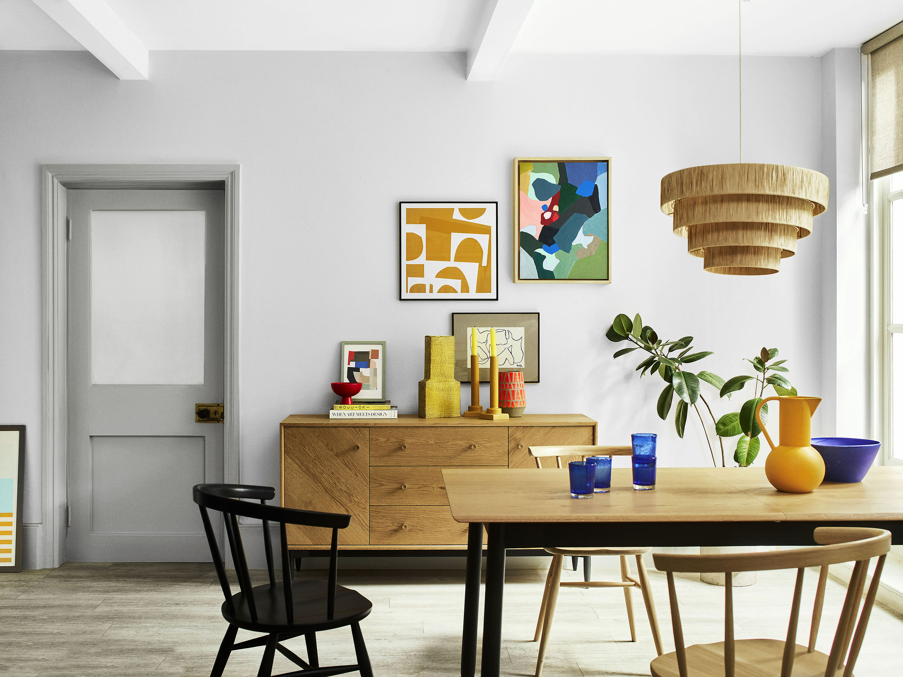
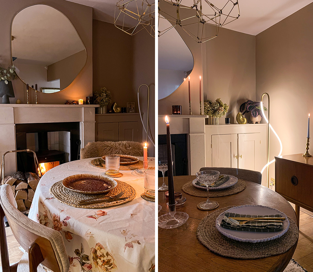
Neutrals for east- and west-orientated rooms
Cool in the morning and bright in the afternoon, pinky-neutrals make the most of late afternoon light in west-facing rooms (think warm Pale Nutmeg or modest Dusted Heather) while neutrals with a touch of blue or green (misty Light French Grey™, laid-back Cornish Clay™) warm up cool evening light in east-facing rooms. Here, genteel Pumice Brown™ leans into early evening light in a dining room, creating a dusky effect conducive to entertaining.
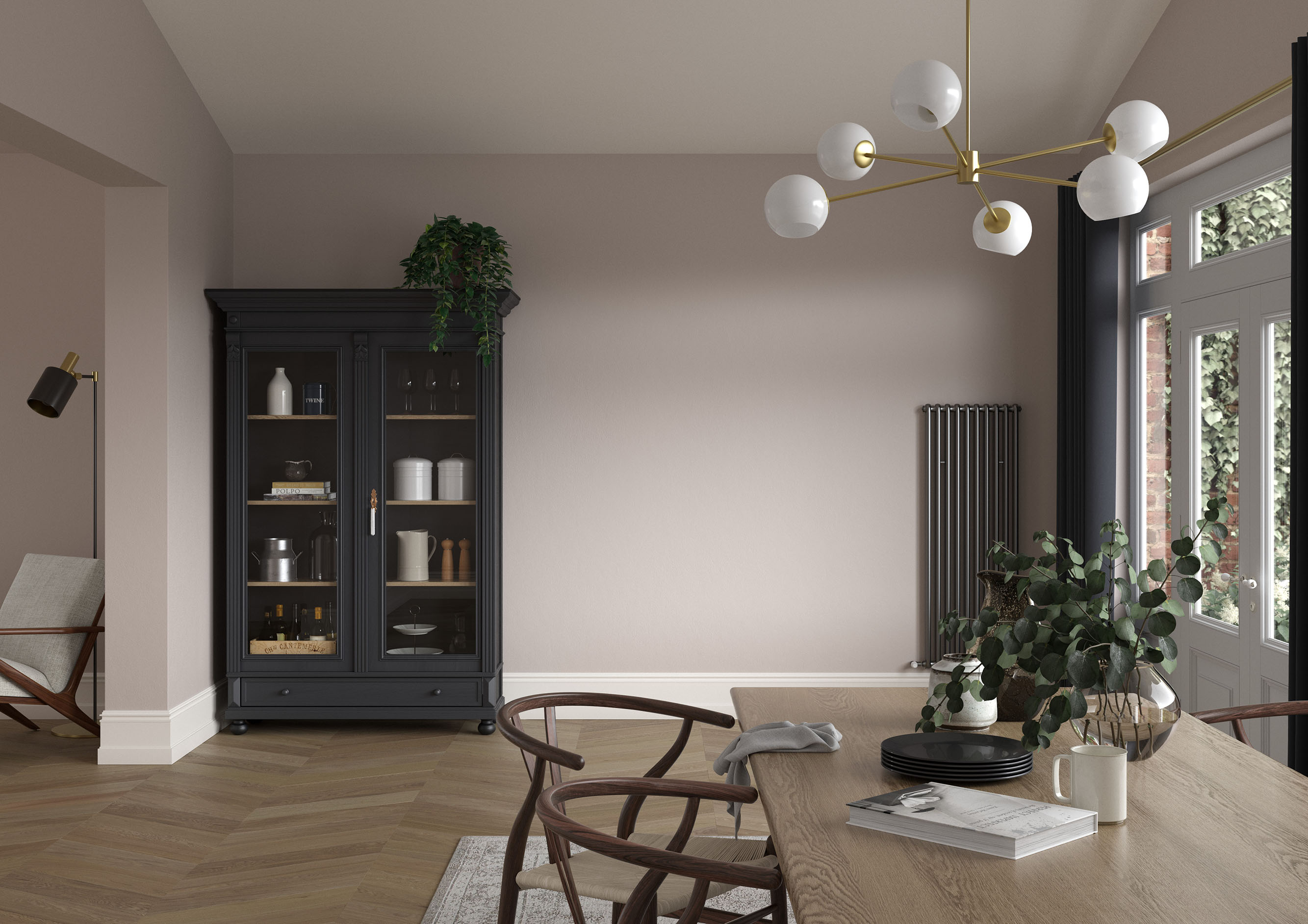
Acing neutrals with artificial light
It’s not just natural light that can affect your neutrals. A yellow glow is emitted by halogen and incandescent bulbs, which make walls appear warmer, while white bulbs give off a bluer, cooler light. To avoid overcomplicating your colour, we suggest opting for neutral white bulbs, meaning come evening your colours will stay truer to how they look during the day. Here, Mid Umber retains its depth and drama by night, thanks to the right light.
For more expert tips, read our previous article on nailing the ultimate neutral, with in-depth advice on everything from undertones to woodwork and lighting.
Commit to colour
Not only does Dulux Heritage look beautiful, but it feels gorgeous under your fingertips, with a velvety matt finish for walls and an eggshell with a soft sheen for woodwork. Try it today by ordering a tester or commit to colour by choosing a can.
Share your neutrals on social using #MyHeritageHome and tagging @DuluxHeritage – you could feature on our Instagram and Facebook pages.