Inspiration Article
Colour trends 2022: What shades will shape how you decorate next year?
It’s been an uncertain couple of years, to say the least, and that instability has inspired the colours we have chosen for our homes. Safe greys. Soft and comforting neutrals. Shades connected to nature. But now, as we slowly emerge from the pandemic, we’re combining the colours that gave us tranquility during a particularly tricky period with hues that herald an exciting new era. With a feeling of hope and positivity for the future, we’re embracing colours that express optimism and champion change. We’re showcasing shades that feel joyful. And we’re breaking boundaries and experimenting with the unexpected. After all, we’ve rethought the way we live and use our homes, so it’s fitting that we’ve given the walls that surround us a refresh. Drawing on the same expertise used to predict Dulux Colour of the Year – where our esteemed panel translates global design trends into a trending shade – we’ve cherry-picked the hottest colours for 2022 that define the mood of the moment. Be the first in-the-know – and the first to try them with Heritage by Dulux Collection.
Into the light
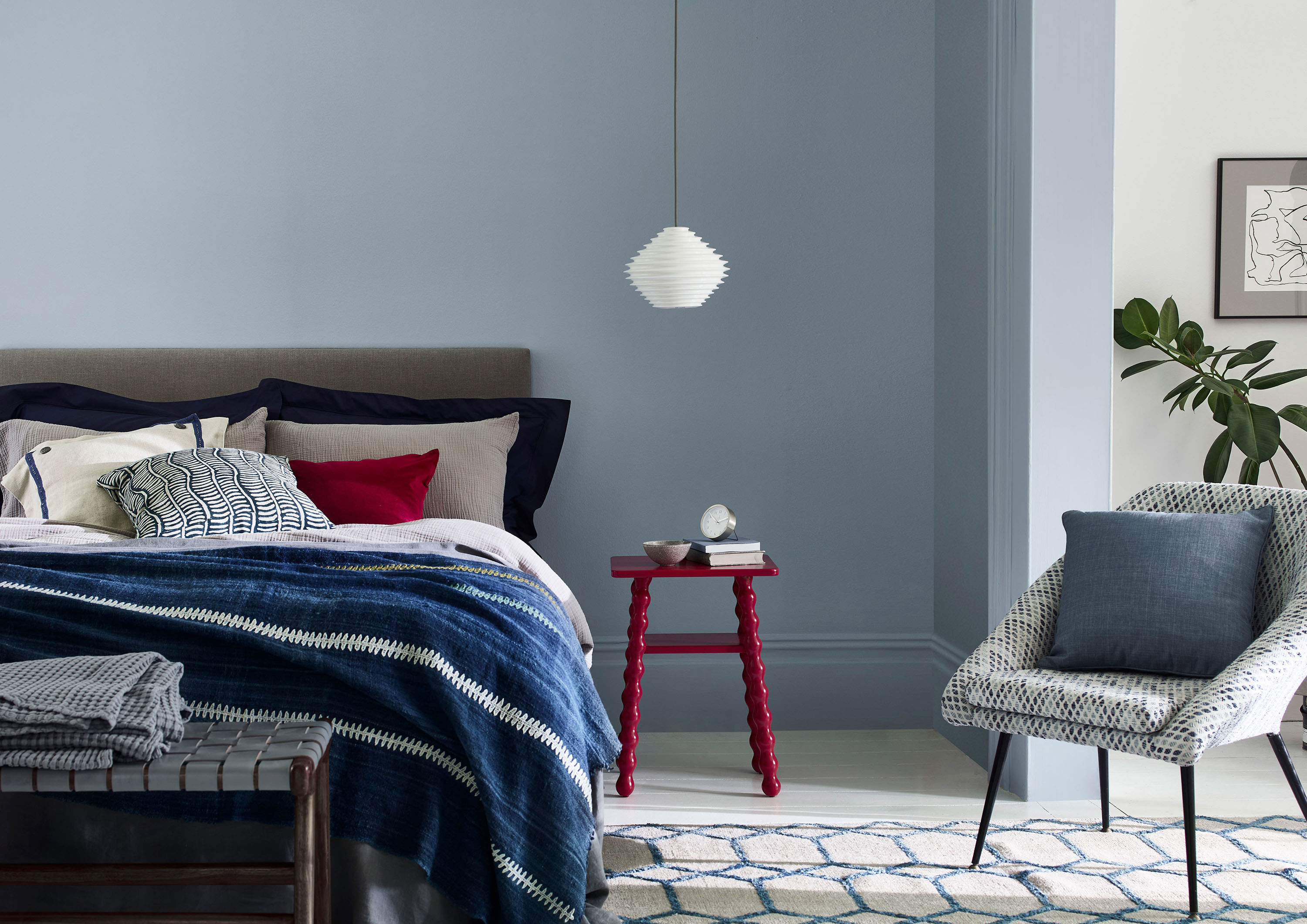
Moody blues. Emerald greens. #StyleItDark has been trending on social for several years, with everyone wanting to envelop themselves in a cocoon of colour to comfort and console. The mood was heavy – as were our moodboards. But with the passing of the pandemic, the easing of lockdown and the return to routine, things are starting to look lighter and brighter, and our spaces are following suit. Specifically, shades of light blue have emerged from the shadows to become one of the most popular choices, with no sign of slowing down. In the Heritage Collection, light blue paint like Clear Skies, Copenhagen Blue, Country Sky™ and Blue Ribbon are perfect picks for creating a sense of calm and positivity, while opening up rooms and affording a sense of space. Experiment with tester pots of each and enjoy a breath of fresh air.
White noise
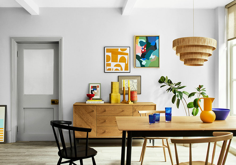
Keeping things similarly light, white has been causing a bit of a buzz of late, with the crisp classic once again the colour of choice for interiors insiders and Instagram influencers. With so many variations on white – from clean and pure, to hints of green and yellow – it’s anything but cold and clinical. In fact, some of the finest off-white paint is full of warmth and depth. Fresh new iterations of the shade – such as Indian White, Chalk White, Panel White and Mallow White in the Heritage Collection – offer a simplicity that many of us are craving in our spaces right now. White wall paint creates rooms for rest and reflection, focus and concentration, and acts as a backdrop to curated furniture and period detailing (pick out woodwork in something tonally similar but noticeably darker such as Beachcomb Grey™). Better still, white is one of the most flexible hues there is, working in any room and with any other colour. No wonder we’ve come full circle and it’s firmly back in fashion.
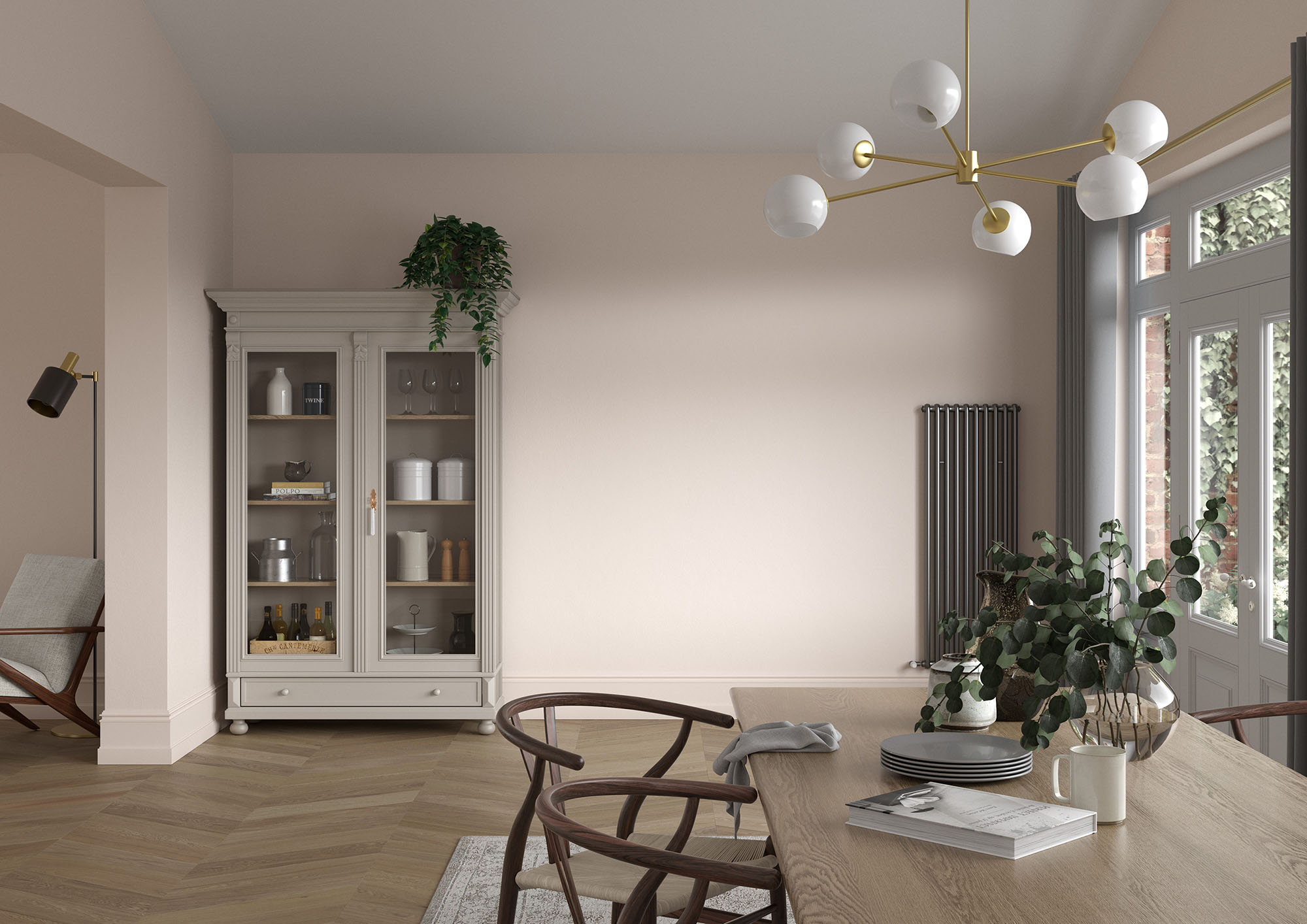
Beige is back…
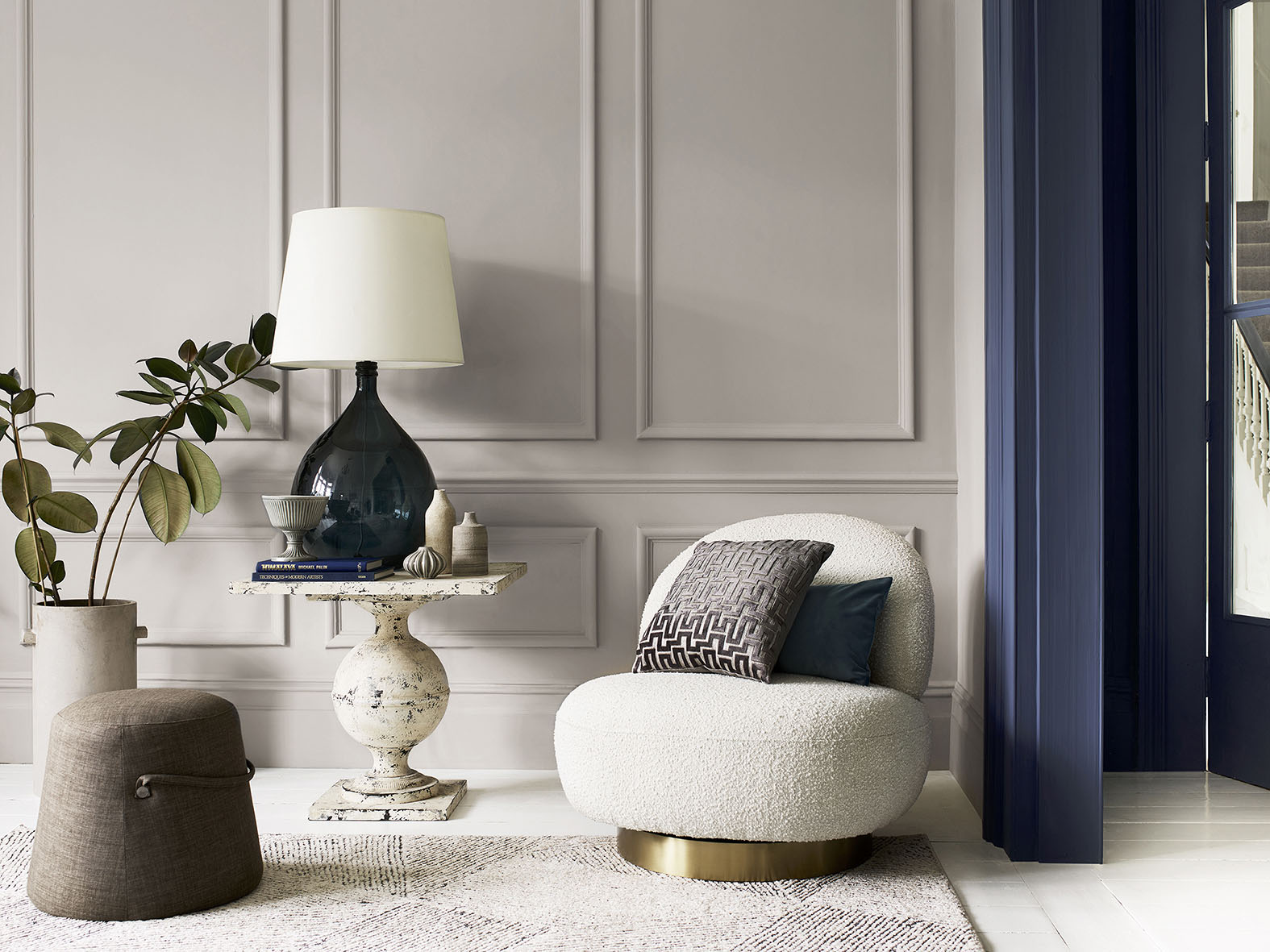
… but not as you know it. ‘New-wave beige’, as we like to call it, is anything but boring, and comes in all kinds of trend-led takes on the traditional shade of yesteryear. Much like pales and whites, beige paint has become popular again as people seek out colours that feel positive and familiar. ‘Greige’ is one iteration that’s inspiring across Instagram, combining all the warmth of beige but the sleekness of grey for a look that’s beautifully practical, and has been called the perfect neutral as it works well in both cool and warm schemes. Try the trend with Pebble Grey or Pale Walnut from the Heritage Collection to recreate the look. On the other hand, classic beige wall paint – the likes of Bathstone Beige and Biscuit Beige – are being used in bold new ways, whether it’s with a pop of pure, primary colour, or in a contemporary setting paired with accents like polished concrete floors. On social, homeowners have also been pairing it with blues to brilliant effect – Light Cobalt or DH Indigo work particularly well.
Flower power
Once-forgotten, lavender and lilac have been storming our social feeds of late, but they’re far from old-fashioned. Childlike, sugar-sweet shades have been replaced with chic, grown-up pastels on the right side of pretty. These new purple-grey paints are imaginative and intoxicating, from dusty Violet Night to chalky Lavender Grey. Both are at once nostalgic and fresh – a happy combination – and are better still teamed with a simple neutral such as Cornish Clay. Even more evocative is Wild Blackberry, an intense plum with a bit of an edge, which can be used to create intense and dramatic interiors. Indeed, the next generation of purple signals a new era for this widely misunderstood shade.
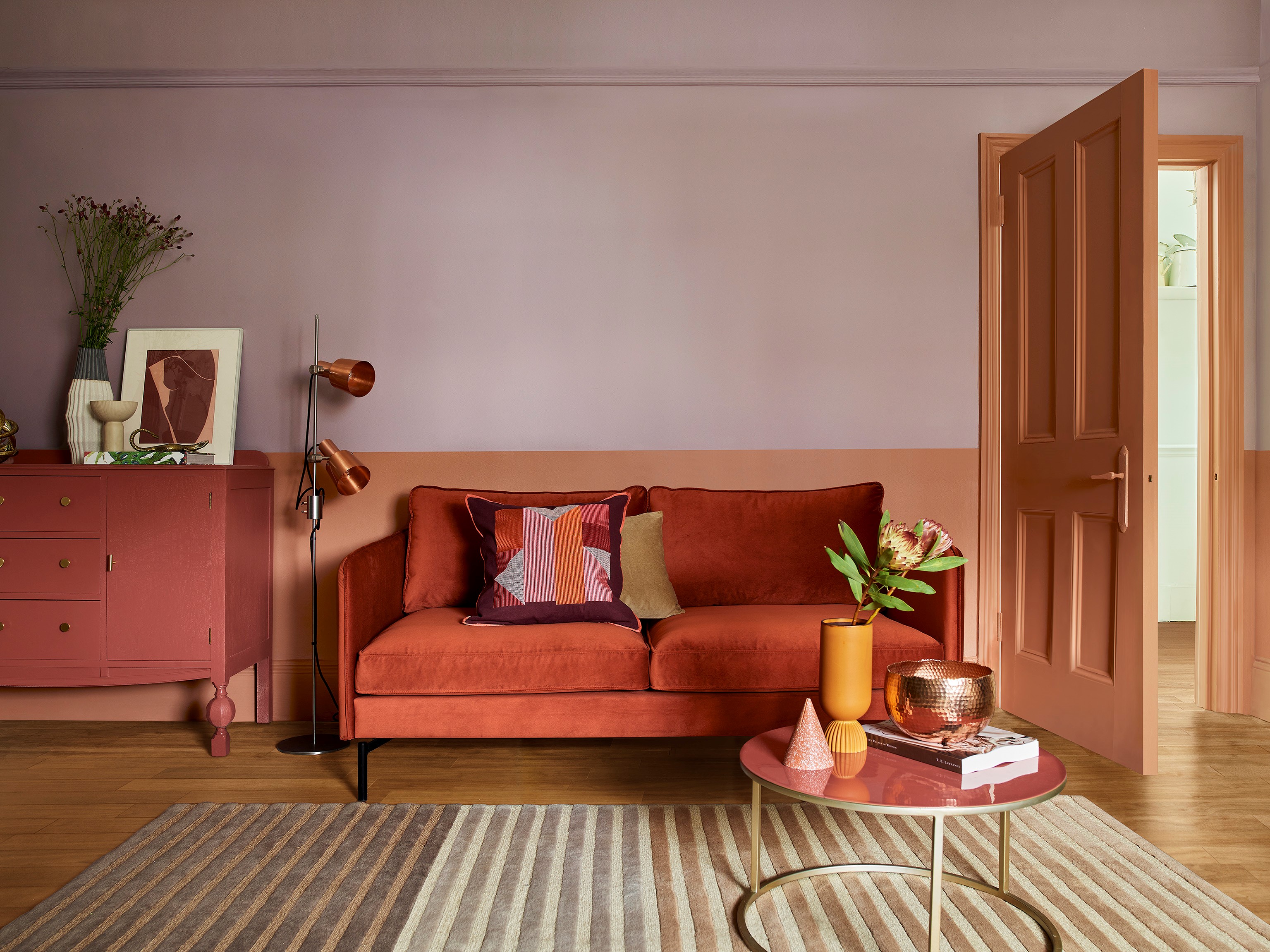
Seeing red
As the colour of danger and passion, red is often underused in our rooms, but has been soaring in popularity as our confidence to experiment has grown. We’ve also learnt that there is more than one choice when it comes to shades of red paint, from lipstick red to a burnt orange colour and rusty terracotta, opening up a whole new world to dip into. Brilliant news, then, that the Heritage Collection is home to the best: glamorous Pugin Red is like a Hollywood movie star’s pout; rusty Red Ochre takes its colour cues from Mars; baked Red Sand is beautifully earthy and autumnal; and bronzed Inca Orange has all the character of burnished copper. Try with an in-vogue mauve like Dusted Heather for a truly fashionable look. With rusty tones providing a softer aesthetic for those not wanting to commit to full-on rouge, it’s no wonder we’re ready for red on our walls.
Get the scoop
One scoop or two? Encapsulating the essence of innocence and playfulness we’re all seeking as we emerge from being cooped up for so long, ice-cream shades are all the rage. Soft pastels are getting even paler, with a childlike quality to them, and are being used together for a look that’s pure joy. From the Heritage Collection, think a pop of Powder Colour mixed with a dash of Fennel White and a sprinkling of Clear Skies. No longer just for kids’ zones or playrooms, these pale pigments are being painted in all manner of grown-up spaces, from ultra-creative WFH studios for media types, to super-fancy kitchens for dedicated foodies. They’re about having fun and not taking life too seriously – a light yellow or a pastel purple colour, for example – which is something we can definitely get on-board with.
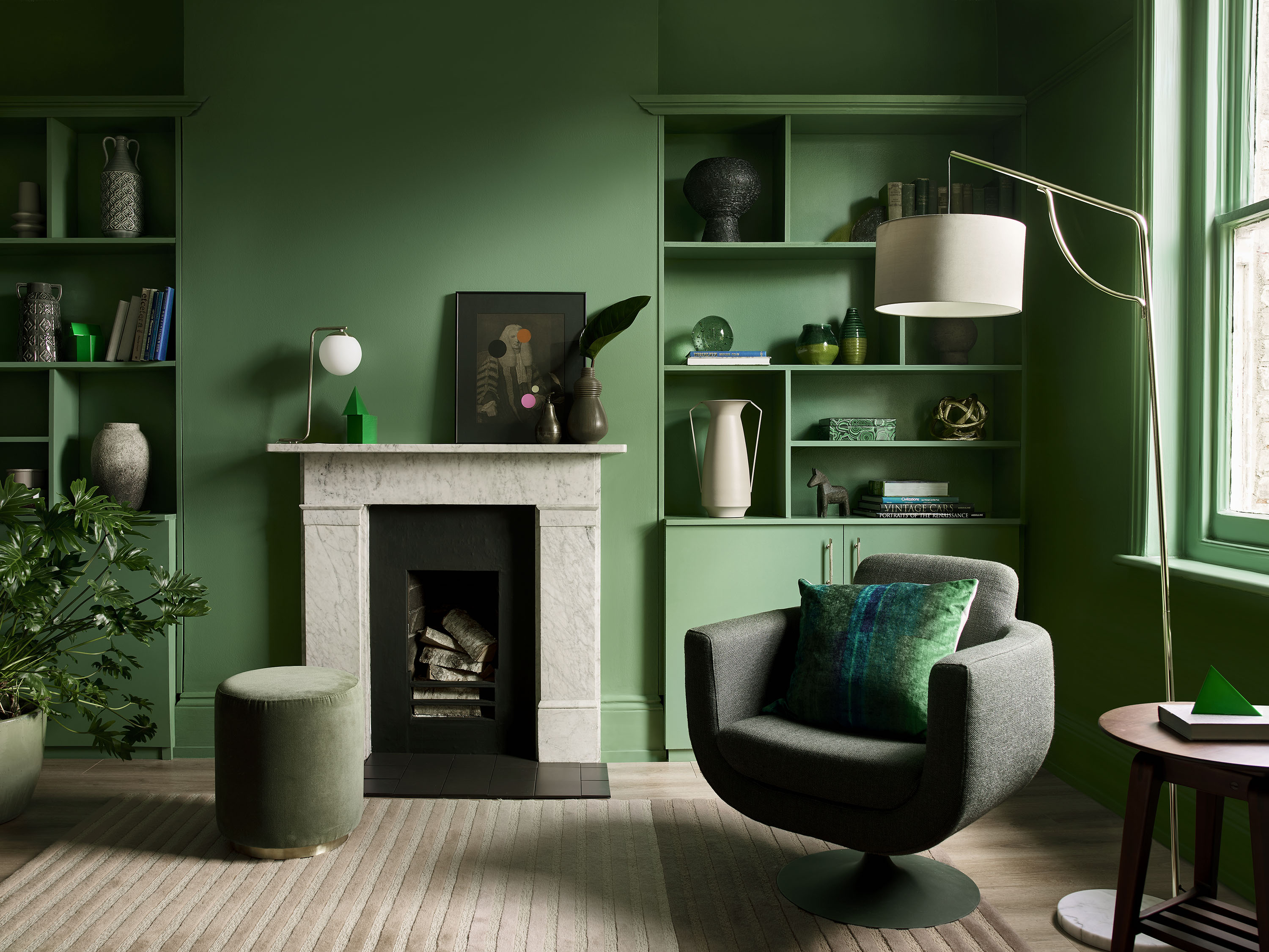
Nature knows
Our connection to nature and the world around us has never been more important – during the pandemic, or post. Which is why colours that nod to nature will continue to be important long into next year, and beyond. Forest green paint. Earthy browns. Sea-blue paint. Sandy yellows. One look at our colour chart and it’s clear that the Heritage Collection has a lot of natural hues to choose from: favourites include DH Grass Green, Waxed Khaki, Maritime Teal, Mud Lark and Wooded Walk, amongst others. It’s these shades that root us to what really matters. Connect us to our cores. And remind us that nothing is as beautiful as what’s outside our own front doors – but it’s even better when you can bring it inside. A kitchen extension that feels like an extension of the garden. A spa-like bathroom that evokes the environs of a tropical oasis. Biophilia has never been bigger, and our paint can help fan the flames of your passion for nature.
Commit to colour
Not only do our colours look beautiful, but they feel gorgeous under your fingertips, with a velvety matt finish for walls and an eggshell with a soft sheen for woodwork. Try them today by ordering a tester or commit to colour by choosing a can.
Try a trend-spot
Think of yourself as a bit of a trend-spotter? Share your top predictions for the colours you think will be popular in 2022 using #MyHeritageHome and tagging @DuluxHeritage on social – you could feature on our Instagram and Facebook pages.